Sunday, September 29, 2013

Promotion and Plumage

I've been absent recently, taken with outside concerns, and happily, the creation of a new piece or two to share.  This time around we have another Singapore Slingers poster - two events advertised on one image.  Halloween is just around the corner, and though I wanted to steer clear of the usual pumpkins, ghouls and black cats, I embraced the traditional colors.  Here we go:


 I needed two strong areas of contrast for the venues to be noticeably listed, so I gave our model two large "fans" - something of a lunar Sally Rand.  I used to include venue addresses, show times, cost and such - nowadays, I figure that if someone is intrigued by the image, they can do the homework necessary for more details.  Our shows are gladly becoming more and more popular, often selling out - as such, there is more room on the posters for imagery, rather than extensive information.  Let's have a look at our lady...


She's simple in nature, but evocative of the fact that costumes are encouraged, particularly at the latter of the two shows.  The more festive our audience, the better the show - a sensible truth. 


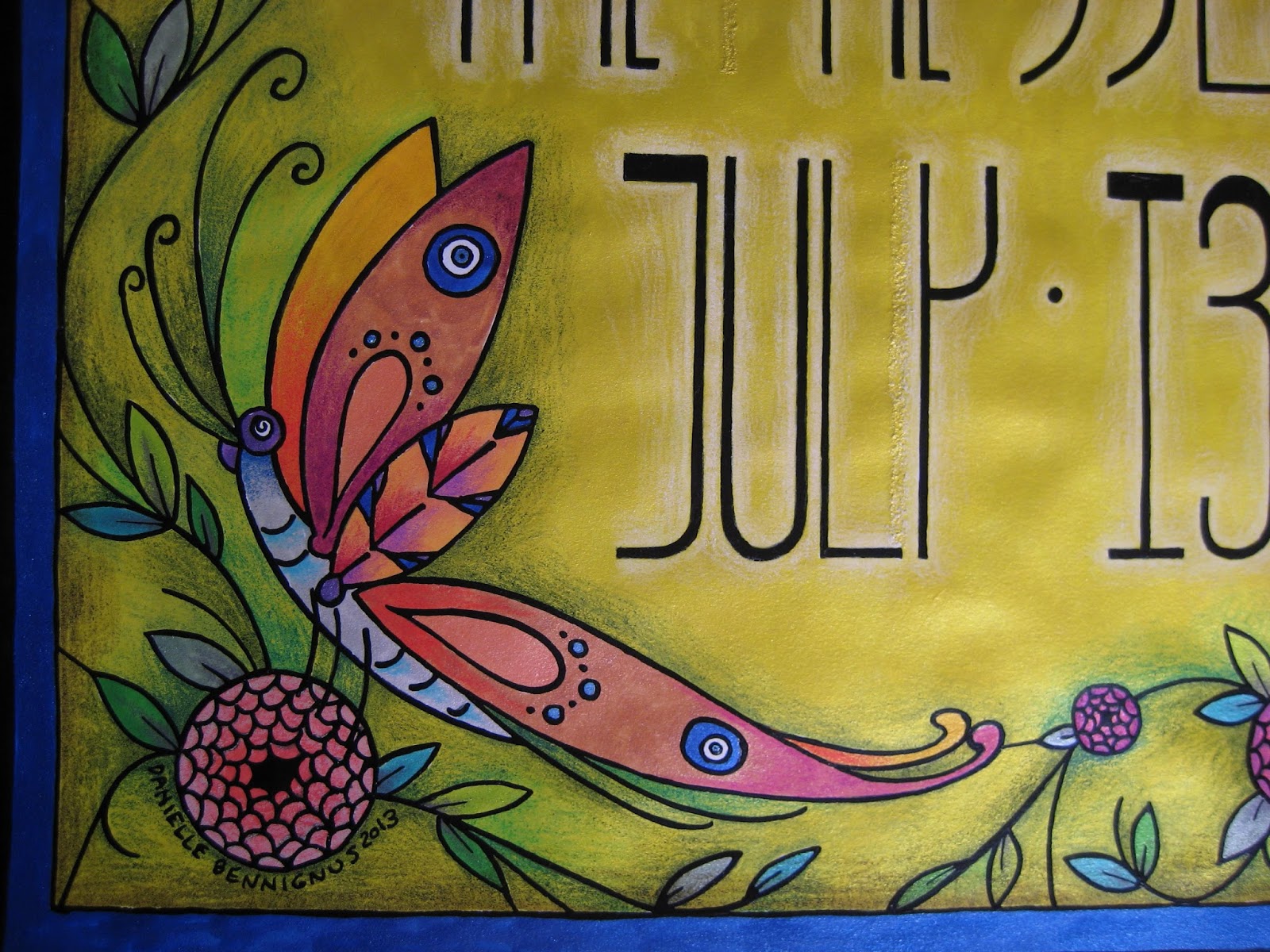
 The fans were a joy to enhance along the edges, extending abstract plumes to fill in the outside negative space, and make it a bit more clear what the gal is handling.  It goes without saying that feathers are a joy to illustrate - and seeing as how I strongly refrain from purchasing them nowadays (part of a largely vegetarian lifestyle), this provides me a manner in which to celebrate them vicariously, without harm to the creatures that wear them.

A closer look at the lettering:


Lettering design is always initially intimidating - I'm sure it will be, eternally.  I tend to over-think in this matter, worrying that I won't capture the theme appropriately.  The words are easy - the styling of those words instills fear.  In this case, I went just as vertically as with the last poster - just a little more tapered along the bottom, and in chartreuse against purple.  Regardless of the silhouette, the letters must "pop" visually, in order for the poster to catch the eye of passersby - colors help immensely in this aspect.

Finally, the signature.  On my non-commercial work, I sign almost exclusively with an initialed oval, also stating the date of completion.  On posters, however, I have to bear in mind that the viewer might want to see more of what I do - so it makes sense to provide the full name (as well as the copyright notice), so they can find me online, should they so desire.  Always a strange balance of letting the piece shine, and trying not to be too obvious in my plea to be noticed professionally.

To the season, and further musical endeavors.  I couldn't be more pleased to know that these pieces help to garner more attention around the orchestra... and more tickets sold.  Success...

Sunday, September 15, 2013

Garden of Pleasures


I have a way of driving myself somewhat crazy, in terms of procrastinating when it comes to posting new work on the blog.  This is a perfect example - the most recent Singapore Slingers poster, for an event back in July.  I kept meaning to photograph and document, but waited so long that I actually forgot where the original drawing ended up.  After a half-hour of frustrated portfolio-scanning, I recalled that it was hidden in a frame, behind another poster.  For safe-keeping, which is a great concept - but not so great when the location is forgotten entirely.  Safe, indeed...

Anyhow.  This poster was a real joy, not only in that I took the easier route with metallic ink throughout, but also because we decided to increase our standard poster size from 8 1/2 x 11" to 11 x 17".  This freed my mind and hand up immensely, allowing much more room for design.  I had recently been reading about Louis Comfort Tiffany, and his stained glass creations clearly affected the thing.  The butterfly, as with so many other features in my work, offers Nazar Boncugu references in its wings.  (Also, if you look closely alongside the "y", you can see a correction/repair made, as my often-distracted mind initially thought an area that shouldn't have been inked... should.  X Acto blades and patience are absolute necessities when this lamentable situation occurs...)


I chose to embrace the vertical nature of the dimensions, and went with somewhat Mackintosh-inspired lettering.  Super Black on bright yellow ink, with white pencil shading behind the figures to help things pop.  You can see the reflective mica in the photo below - more of that to come...


Bees.  Our household is rather nutty for these beasts, as they have long flocked to the datura wrightii plants that have followed me through several moves.  In this case, however, they have to make do with Beardsley-inspired "fish scale" roses...


An angled shot of the poster, to show a bit more of the reflective nature of the metal-based inks.  Between the vividness of the inks, and the layered shades of the pencils, the resulting color reminds me of nothing so much as Liquore Strega (a favorite).  Granted, this sheen doesn't show up in the reproductions we distribute throughout town, but the intense colors come up beautifully.  There is also something rewarding about their visual appeal, on pieces I decide to frame... at least, unless they are hidden behind another piece within that frame.  Seeing this one again, it's probably time to give it the greater honor of actually being shown...


My best wishes always, and stay tuned for the next poster.

Wednesday, September 11, 2013

Gearing Up


 So, after brief absence, I have returned with the finished piece I was roughing out at the time of my last post.  Let's have a look at the Derby Racer horse in full bloom, with a self-portrait astride... I have plans for this illustration.
 

 I don't believe I've mentioned it before, but I'm shamelessly in love with my vehicle, a 1994 Caprice Classic station wagon.  I envision the old boy as a sturdy, reliable draft horse - loaded with power, yet possessing a sensitivity that makes long trips a sheer delight.  I adore that machine.  However, I had long wanted a mode of transportation that reminds me of a harrowing, exciting ride aboard a racehorse... in this case, a Derby Race(r) example.  That machine came along my way in the shape of this:


 A wonderful 2003 Stella scooter.  I recently learned that a dear friend had decided to part with it, and I hopped on the offer immediately.  Still in the process of becoming street-legal, I furthered my bonding with the scooter by coming up with this design.  The image will be printed on vinyl, and applied to the cowls (wheel covers), just above the checker border...


 ... a happy marriage of new design and existing trim, and characteristic of speed and movement.  I'm very excited to see how the whole picture looks.  The checkerboard continues in the model's dress, scarf and helmet, and her mount is a very close representation of Marcus Illions' impeccable Rye Playland carvings.  I insisted on a palomino, the colors of which lent themselves to all sorts of tonal joys in the horse's trappings.


 As usual, I incorporated metallic ink - this time in the tack hardware, and along the rear of the saddle blanket...


I am awfully fond of natural horn-colored hooves, and put them on this beast.  The ankles and fetlocks of horses are an honest-to-God treat to draw.


Finally, for the sake of shaking things up a bit, I'm posting two images of what my work looks like in the Land of In Between, when I am beginning to apply ink via nib and inkwell.  My last entry featured raw sketches - this is the final rendition of graphite on bristol, after many layers of finessing and contemplating the sketch into a line drawing.  It's a gradual process of refining and elimination of unnecessary excess - using tracing vellum, I make a carbon with a wood-less pencil on the back, and transfer the whole shindig to smooth bristol (400 series, don't waste your time with anything else.  I learned the hard way).


 One more, of the horse's girth strap.  Once the ink is applied and fully dried, I go through with a drafter's cloth eraser bag and gently remove the graphite.  Then it's on to the coloring process, and re-inking, if I so choose.  The process is at times terrifying (once you've gone through the experience of a hand-tremble after nearly finishing a piece, you learn to breathe at meditation-level as you work from that point on), but deeply rewarding.  I never learned a thing about computer-oriented graphic design, and frankly have no interest - for me, it's all about the process of working on paper, with relatively primitive tools.  A very, very deep joy.

Here's to the road ahead...

Friday, August 23, 2013

Horse Sense


  I'm certainly not alone when I say that I adore horses, and have for many years.  From my early years as a rider, to my first job as a stable worker, and now simply enjoying these beasts from afar - they have no peer when it comes to their balance of grace, power and silhouette.  They practically beg to be immortalized visually - and the countless examples of artistry depicting them show that I am far from alone in my experience.  I have a distinct type of respect for them and adore putting them on paper.


 At the moment, I'm taking a brief break from working on a piece that's harangued at me for many months - a cartoonish self-portrait aboard a Derby Racer horse.  For the uninitiated, these amusement devices in short terms consist of a circular horse gallery three times the diameter of a standard carousel, which rotates three times as fast.  When operated correctly, the four rows of horses stagger back and forth erratically, in effect "racing".  There are only three of these machines left in the world, a woeful truth, as the sensation of riding them is nothing short of exhilarating.  The finest example is at Rye Playland in Rye, New York - it is well run, and boasts the beautiful work of Marcus Charles Illions - known as the Kingpin of American carousel carvers.  His faces were incomparable, his carving technique without peer - he understood horses, and celebrated them in his work.  While I take a slew of liberties in my illustrations, I'm trying to capture at least a hint of his energy in this piece.  I don't often care to share the sketching phase, but wanted to document this one in case it finds its way to the trash, like so many others before it.


 And now to view a few other horses, from previous drawings that span several styles.  This little detail is from a much larger self-portrait drawn many moons ago, of my beloved apartment in Jersey City, New Jersey.  My bedroom was one of the most comfortable nests I've known, and inspired many deeply detailed pieces worked on at night for hours at a time.  This is a toy horse from the 1940s, in striped jersey with wooden hooves - he's still with me nowadays.


 Pulling back a bit, you can see that he's got friends - a corduroy seal and calico giraffe, as well as the boudoir doll I made in 1998, representing the aforementioned Taffy character.  The boudoir doll is still here as well - waiting his moment in the sun.  The few times I brought it into the City to show to friends, it caused quite a ruckus of fascination and queries from total strangers - they even spoke to the doll as though a benevolent spirit.  I still think he has a future of sorts.


Another carousel figure - this one a leery palomino, watching to the rear as his mistress reaches for a brass ring.  I've always had a terrible weakness for copper horses with flax manes - perhaps Roy Rogers' lineage as a fellow native Cincinnatian has had that effect on me.


 A wonderful, true-to-life illustration of a very special horse from the Dentzel carousel at Glen Echo Park, in Maryland.  This is one of the finest machines in the country, and this horse is lucky enough to wear the same paint it did upon leaving the factory in 1921.  This drawing was done for two dear friends who were married at the park - both fanatical amusement park history buffs.  They wanted a piece to adorn the carousel admission tickets they provided their wedding guests - there could be no better model than the Indian pony.


A tiny bit closer, to show the animal's lovely face.  While I am a die-hard Illions loyalist, the carvings of the Dentzel family are deeply respected, indeed.


 Finally, an old favorite that once served as the introductory page of my portfolio.  I believed in starting off politely when a prospective client viewed my book - particularly in the case of drop-off submissions, when I couldn't be there to speak for the work.  Taffy, aboard a palomino, saucily did the job for me.


 There is a pretty wry energy to these older pieces, and I can only guess that such an attitude was right for the late 1990s.  Editors loved this stuff, and many were able to utilize pieces straight out of the book.  Others were looking for a more subdued nature, and I gave it to them - but let them know very early on that there was a certain level of spice in what I did... and do.


Equines - realistic, cartoonish, linear and beyond, are such endless joys...


Wednesday, August 21, 2013

Medicinal Waters


 I thought it wise, before heading under the coverlet for the evening, to post the aforementioned Hippocampus illustration.  This is the last of my drawings that my late father saw - on what I didn't realize was my last visit to him, I happened to slip it into my traveling case to cheer him up... I knew he was sick, but not exactly how sick.  His eyes lit up, and he ran his fingers across the curves, spots and angles - "It's so musical, like a fugue."  True, I almost invariably listen to music while I work - even recordings of him in his prime as a tenor, singing German lieder.  Those can be a little on the tear-jerking side of the coin, but they are invaluable.


This piece was actually done in an attempt to convey what it feels like to swim in the Atlantic during the winter months.  As a patch-bearing member of the (World-Famous) Coney Island Polar Bear Club, I spent countless Sunday afternoons from November through April in the frigid surf, thrilling at the endorphin rush that only winter bathing can offer.  As a southern Ohioan/northern Kentuckian in a decidedly Yankee environment, I perfected an ersatz rebel yell in the medicinal waters of "Sodom by the Sea".   Yes... that would be me among the scaled monsters in the drawing, poised to feel the water, while simultaneously reaching for the sun.


 Funny enough, the hippocampus has played a distinct and repetitive role in my life - it was such a figure aboard the treasured Philadelphia Toboggan Company #6 carousel in Colorado that stole my heart away, and seduced me into the world of historic amusement devices and parks.  That these mythical creatures were not uncommonly incorporated in turn-of-the-century seaside architecture still astounds me, as they are almost unheard of nowadays.  They are about as close to a totemic animal in my life as I've ever known.


Coral manes, seafoam bridles and fins aplenty adorn them, as well as the sharp teeth of sea dragons.  And speaking of sea dragons - should you find yourself on Coney Island, make the small pilgrimage to the Child's building on the Boardwalk.  The facade features some of the most fantastical terra cotta ornamentation in the City - among which dwell two sea dragons... fangs bared.


Lastly, a closer look at the fins on these beasts - I enjoy the sense of play at work, sifting in and out of the breakers.  The Atlantic is alive and effervescent always, but especially in the winter months.  For winter bathers, it is Our beach, roaring with energy and vitality.  There is truly nothing quite like its embrace.


"Once you get Coney Island's sand in your shoes, you can never get it out", as an oft-repeated saying goes.  And so, for the moment, this is how I remember it best - in my heart among the creatures of the deep, bathed in the glorious sensation of truly electrifying waters.  A Coney Island of the mind...


Semper Fidelis


My earlier blog post inspired me to have a look through several portfolios, and I happened upon a particular piece that defines one of my old axioms:  Let a drawing stand on its own feet.  In this case, we're talking about an illustration I created as a tribute to a former flame - a Marine who was, at the time, preparing to enter Officer Candidate School.  While the relationship didn't quite pan out in the end, some remarkable drawings resulted from the union - this is the only one I still possess.


Now, I admit that my awareness of the USMC was lax at best prior to the romance, but after much reading, attendance of the Birthday Ball and attending graduation at Parris Island, I came to appreciate the sheer level of fanfare and heraldry inherent to the Corps.  As such, it was a lot of fun studying the Officer's uniform, and adapting it to a more pinup-friendly mode.  Note the Eagle, Globe and Anchor collar devices...


 ... and no USMC pinup would be complete without the presence of Chesty, the Corps mascot.  Of course, I took a serious liberty in seeing to it that my rendition made this beast into a female - one with much attitude, like her mistress.  The blood stripe stockings are rather fetching, too.


The Officer's sword, a natural element to the piece...


One more look at the tresses on our model, trimmed out with copper metallic ink.  My fondness for this substance is inexhaustible.


All in all, a hell of a lot of fun - and very good to see her again after all this time.  I think that, despite a rather woeful origin, she stands well on her own as a sensual, remarkably confident pinup.  I would love to do a run of prints for sale, as I recall she created something of a minor furor among the Marines in residence at Maritime...

Gnothi Seauton

 As a creative person (those astrologically-minded might consider it a Libra characteristic, as well), I am subject to periods of great production, as well as outright doldrums.  Sadly, I have been in the grip of the latter for some months, and my work, mentality and heart have suffered for it.  There really is no excuse - if anything, I'm in the midst of facing my own laziness, sadness and unfounded fear of the creative force - and addressing it at long last.  Anyone who has lived to any extent knows the presence of personal demons - mine being the loss of my father a few years ago, and the subsequent, sudden uprooting from the place I loved and called home during my early adult years - New York City.  Self-doubt followed, and the flagrant pace at which I led my illustration career came to a gradual standstill.  

"I'm taking a little time off", I have told people - a project here, a commission there, occasional posters for the Singapore Slingers.  But no more of the pieces I drew as a celebration of life itself - the dizzying visions I constantly had in my mind which seemed to leap from the sidewalks of Manhattan, and the sands of Coney Island.  In short, I was afraid - of the emotions that would emerge as I drew, of the possibility that I might not be able to express myself as skillfully as before, that I would be haunted by the memory of my father's incredibly honest, elaborate and in-depth critiques given to my prior work.  I had brought so many pieces to fruition with him in mind, on tenterhooks to share the latest with him.  The last one he saw, a portrait of a winter siren surrounded by coral-maned hippocampi, he compared to a Bach fugue, going into great detail the musicality of the piece.  He had a good handle on what I create - the relationship was hand in hand.

For several reasons, this weekend I decided to shut out the rest of the world and sit at my illustration desk, a heady mix of music lifting my dull brain... and draw.  Something.  Anything.  No goal, no project, no prescribed purpose at all - just for the sake of expression.  I closed my eyes and thought of the City (always capitalized) I miss dearly, and was soon taken mentally to the shores of Coney Island.  I will never be able to explain the power that stretch of beach holds over me - a life-force bubbles in the surf itself.  I decided to revisit an image that's been in my mind for years - Taffy and Casimir, dancing on the sand.


 One an androgynous, living butterfly of a creature inspired by the club kid persona of a dear friend of many years (who inspired me to move to New York in the first place), the other a melange of many characters I am particular to:  dandy, dancing-master and horseman.  They are two of the many personalities that waltzed through my mind during endless hours, days, months on the "enchanted Island" - I would still love to work up a book about their crowd, someday.  Children of all ages would likely enjoy it very much.


 As I refined this piece bit by bit, followed by hesitant-then-fluid nib to bristol paper, my mind slowed, rested... then began to rejoice.  A calm rush of happiness came over me, with the reassurance that, Yes - I can still do this, No - there is nothing to fear, and Yes... it's quite alright to feel my father's presence.  It's always there, and always will be - what matters is how I approach and harness it.  Energy is a constant, after all - what one does with it determines everything.


 Amusingly, my old methods of delineating forms came back to me in an instant.  Most of my newer work is more "fleshed out" - the arms have more mass, the fingers are articulated, things are at least a touch more in the way of being realistic.  This piece is pure Danielle during her enthusiastic discovery of New York City - every aesthetic, bodily and spiritual sense of a great City that had been absent in my life up to the moment I moved there one late August.  A sense of swift, kinetic energy took over my silly drawings - lines, colors and ornamentation suggestive of movement that echoed a pace in life that took me under its wing.  Despite being a stranger, I never felt more at home.


 I only wish I had sat down sooner, and realized how desperately I missed the feeling of drawing for the sake of drawing.  Yes, life gets in the way - but far more than anything, it is ridiculously easy to shut oneself down creatively.  The damage is immeasurable.  For all of my sewing and other side projects, they are pointless distractions compared to the fulfillment of putting my trusty Ivison, Phinney & Company pen nibs to bristol.  This is where my soul resides.

Thank you for dropping by - I look forward to posting far more frequently than I have in the past.