
I have a way of driving myself somewhat crazy, in terms of procrastinating when it comes to posting new work on the blog. This is a perfect example - the most recent Singapore Slingers poster, for an event back in July. I kept meaning to photograph and document, but waited so long that I actually forgot where the original drawing ended up. After a half-hour of frustrated portfolio-scanning, I recalled that it was hidden in a frame, behind another poster. For safe-keeping, which is a great concept - but not so great when the location is forgotten entirely. Safe, indeed...
Anyhow. This poster was a real joy, not only in that I took the easier route with metallic ink throughout, but also because we decided to increase our standard poster size from 8 1/2 x 11" to 11 x 17". This freed my mind and hand up immensely, allowing much more room for design. I had recently been reading about Louis Comfort Tiffany, and his stained glass creations clearly affected the thing. The butterfly, as with so many other features in my work, offers Nazar Boncugu references in its wings. (Also, if you look closely alongside the "y", you can see a correction/repair made, as my often-distracted mind initially thought an area that shouldn't have been inked... should. X Acto blades and patience are absolute necessities when this lamentable situation occurs...)
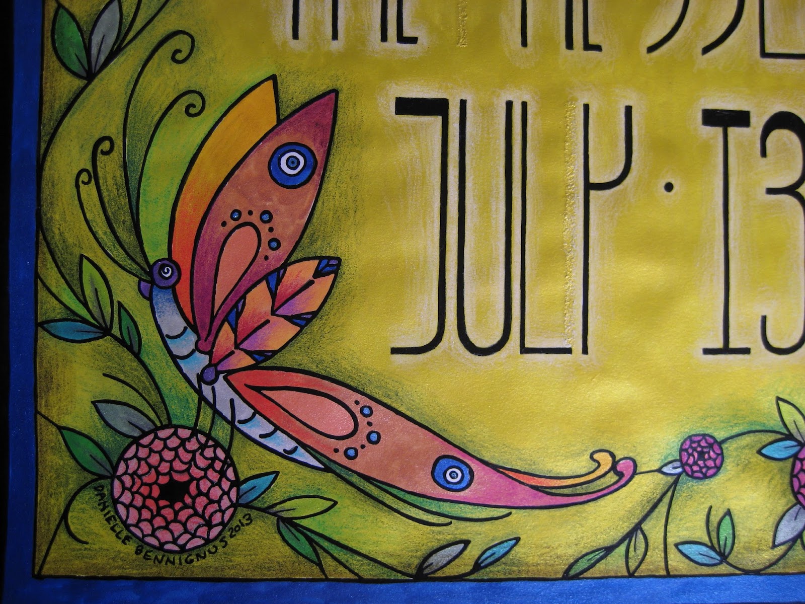
I chose to embrace the vertical nature of the dimensions, and went with somewhat Mackintosh-inspired lettering. Super Black on bright yellow ink, with white pencil shading behind the figures to help things pop. You can see the reflective mica in the photo below - more of that to come...

Bees. Our household is rather nutty for these beasts, as they have long flocked to the datura wrightii plants that have followed me through several moves. In this case, however, they have to make do with Beardsley-inspired "fish scale" roses...

An angled shot of the poster, to show a bit more of the reflective nature of the metal-based inks. Between the vividness of the inks, and the layered shades of the pencils, the resulting color reminds me of nothing so much as Liquore Strega (a favorite). Granted, this sheen doesn't show up in the reproductions we distribute throughout town, but the intense colors come up beautifully. There is also something rewarding about their visual appeal, on pieces I decide to frame... at least, unless they are hidden behind another piece within that frame. Seeing this one again, it's probably time to give it the greater honor of actually being shown...

My best wishes always, and stay tuned for the next poster.

No comments:
Post a Comment