Saturday, December 17, 2011

Another Year, Another Poster!

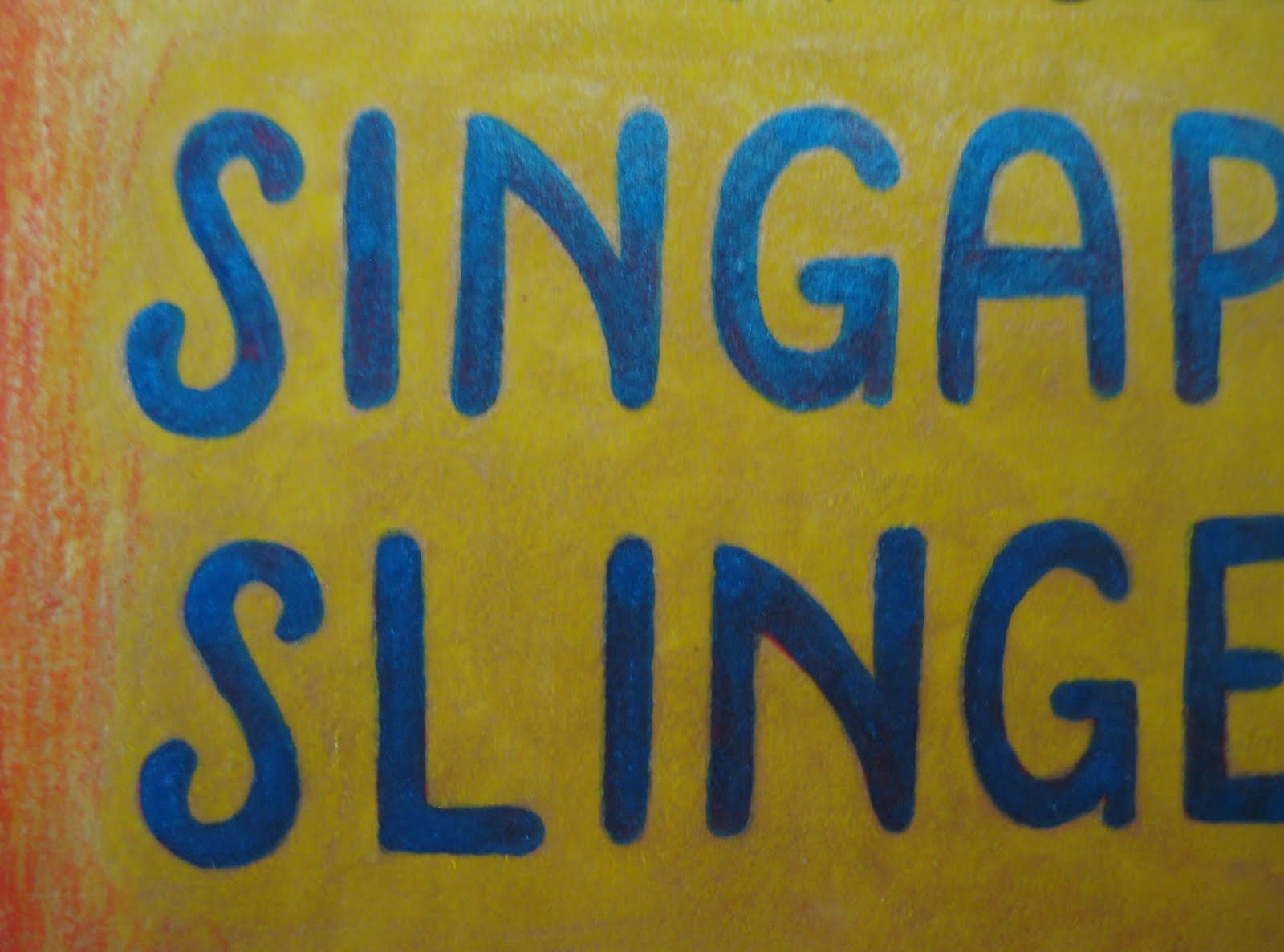
Just in time for the holiday season, we will be distributing copies of this poster throughout Dallas, in preparation for our New Year's show at the Kessler Theatre. This is one of my favorites so far, with some new technical twists that I wouldn't have thought of in earlier projects. For those new to Brave Combo (who we are thrilled to share the stage with for the evening), they are a much-beloved group from Denton, TX... and it's very difficult to categorize them. Nowadays, they focus largely on what I would term "fusion polka", incorporating classical, jazz and rock elements into the dance tempo. However, their influences and practices go far beyond that - my first exposure to them was thanks to their collaboration with Tiny Tim, for their album, "Girl". Anyone who appreciates the late, incredible Tiny is good people in my book. But on to the drawing. Let's have a look!

The whole idea here was to connect the Germanic (polka) with the Freewheeling (jazz) - what better way than to feature two pin-ups, toasting the beginning of the new year? My Teutonic cutie sports lederhosen and miesbacher hat, trimmed in a somewhat unorthodox gamsbart. With a characteristically teeny waist and shapely legs, she proves that lederhosen can be sexy. A look at the metallic scroll on the steel-colored garment...

I've said it so many times... I love metallic inks. The mica pops right off the surface of the drawing, and the relatively even nature of the liquid allows for clear, strong delineation of details. It just hums among the more muted pencil. And now for our jazz belle...

Of course, she's a redhead. I figure that I'll likely be doing most of the Charleston dancing that night, so why not? The only caveat - I just wish I had a beaded dress like this one! I shamelessly detest the cheap, historically-insulting fringed "flapper" costumes that have flooded the market since, oh, 1955 - but beaded strands are more than good by me. Hell, I have a circa 1912 evening gown with just that trim all down the front - appropriate is the word. Our girl holds a champagne glass, whereas her cohort prosts with beer - a happy cultural blend.

And now, a look at my favorite aspect at play, the colors!

I've learned over the years that, despite my gratefulness for a steady-ish hand in terms of pen and ink, the color palette I adopt tends to find itself, and evolve over time. Sometimes it's brash, often soft, here and there in-between... it just happens on its own terms. This time around was no different, but I tried a new technique, to help the girls and central timepiece stand out. Over a base of numerous metallic inks, I did a bit of color shading and white-washing, to mute the tones down. What I ended up with reminds me somewhat of the great traditional fairground painters, such as Sid Howell and Fred Fowle. If I haven't mentioned these all-too-often overlooked artisans, Please Look Them Up. They were masters of leafing and painting techniques, highly respected in their time for their work on early English amusement rides. I would be tempted to give any number of toes for the mastery of what those men were capable of...

Anyhow, away from such gruesome praise! I hope you've enjoyed today's entry - I only hope that it won't be the last this year! But, just in case, here's wishing you a wonderful, prosperous, healthy and happy...
... and Many Happy Returns!

Matinee Melodies


Granted, I apologize for this being a touch late to the party - but at long last, I present the poster for our last show, "Matinee Melodies". This was a program celebrating the music of 1930s Hollywood, so I went with simple black and white, with a cinematic theme. Let's have a look at our model...

As Norma Desmond famously said in Sunset Boulevard, "We had faces!" - and I quite enjoy this lady's coy countenance. She holds her trusty Western Electric carbon microphone, although the cord isn't attached to the element - the magic of illustration, in favor of a better line! Her evening gown is cinched with film, that cascades into a train, circling around the perimeter of the drawing...

A lot of fun, as I love to work with long, fluid curves. The "Matinee Melodies" lettering is actually India ink on white bristol - I prefer to let the paper itself show through, rather than use white ink on top. You can see how rough the inked surface is here...

And finally, a little detail - one of her feet. Just short of being indicative of a fetish, I love feet, and get a kick - no pun intended - out of drawing them. Heels, pointe shoes and slippers in particular have a power over my pen, sneaking in at every opportunity.


What else do I like? Seeing these lines so close-up. I tend to get lost in the moment when I'm working, and miss out on how India ink plays with the almost-smooth surface of bristol, like a funny ballet between the weight/control of my hand, and the unique character of whatever nib I'm using at the moment. And trust me, no two are alike - not only in terms of makes and models, but individually. It's a pain and a joy, working with such temperamental tools.

Up next - the antithesis of this drawing, a veritable orgy of color! Stay tuned!

Saturday, December 3, 2011

Signs of Spring, or December in Dallas

Lately, the weather around here has been in its transition toward winter - more in the way of rainfall and breezes, a second round of new foliage on the plants, and an overall sense of fresh life. In other words, it's a lot like spring. I learned early on that Dallas offers two "growing seasons" - we're at the tail end of the second this year.

As such, when I sat down to work out the colors of the illustration above my mind turned to floral themes, and tones more traditionally characteristic of May, than of December. I created this one for a greyhound-adoption fundraising auction - with limited time on my hands, I had to keep it simple. And while the lines of the thing are to my mind the most significant aspect, the colors are a joy. I've called it "Crocus Pocus", thanks to the sprout-like shapes and colors in the scale pattern...
How about a closer look, to see the wonderful, reflective mica powder in the metallic ink...

I'm frankly hooked on metallic inks - they give me the effect of tinsel, without nearly the risk of overdoing it. They shade beautifully, too - something I use often for the Singapore Slingers poster designs.

A little close-up of the greyhound's face - I just realized that I subconsciously created a "C" in the dog's ear - for "crocus", I imagine...

In all, lots of fun. The illustration will be auctioned off tonight by the Greyhound Adoption League of Texas, hopefully for a goodly sum. Sadly, they've just taken in eleven abandoned pups with a range of serious medical needs - this fundraiser is indeed timely. Any opportunity to assist in the adoption and care of these magnificent dogs is a pleasure to participate in - I'm glad that I can do so with pen and ink. Here's to helping the animals!

Thursday, December 1, 2011

Lives Remembered

Initially I'd held back on posting this illustration, as I created it for a friend who recently lost his father. Being personal in nature, I wanted him to see it before anybody else - but now that the original is safely in his hands, I feel it's proper to share with you folks, too.

Over the years, I've learned, via two-sided experience, that it's almost impossible for me to express grief, or sympathy, for a lost parent through words... whether too strong, or not strong enough, my attempts often fall flat. It's too significant a thing. So I tend to try through illustration - this being an example. I wanted to create a simple, hopeful image to raise his spirits - and honestly, I couldn't think of a better subject than toads. They've brought me a hell of a lot of joy, after all. The banjo refers to the recipient personally - I threw in a pretty lady to serenade on its strings, for good measure. Let's have a closer look at her...

I put her in a frosty, silver dress trimmed with organza and metallic spots - and peacock feathers in her hair, set in a Beardsley-rose ornament. She and the toads are perched on voodoo lilies (amorphophallus rivieri), personal favorites from my garden. The toads, of course, are Gulf Coast specimens - let's have a peek at their faces, just for the sake of personality...


... chipper, and...
... somewhat more serious. The leaves of the voodoo lilies deserve a bit of attention, too - as in reality, they boast a remarkable design of undulating leaves and patterns. They're something of an alien presence among my other plants, their only competition in oddness being Venus Fly Traps and Sarracenia Rosea...


I'm happy to say that our friend enjoys the illustration, to the extent of having it displayed in his living room - I consider that one of the highest honors, others finding amusement and joy in my work. As well, an interesting side note... although it didn't strike me at the time, it makes sense that toads would play such a primary role, seeing as how my own pop adored these little creatures. I'm sure that, subconsciously, I was thinking of him as well, while paying tribute to another's late father. Better yet, both were clearly bon vivants in their own ways - lives truly worth celebrating.

Here's to the memory of loved ones past, and present - at all stages, let's never forget to embrace one another.

Sunday, September 18, 2011

If At First You Don't Succeed...


Welcome back, friends! It's Oktoberfest season, and do I ever have an appropriate entry this evening. Matt's Czech polka band, the Royal Klobasneks, are in full two-beat swing this time of year - what better excuse for a new costuming post? Despite the current leaning toward polkas, sausage, beer and festivity, my thoughts have been focused almost entirely on sewing... and my ongoing longing for a dirndl.

Now, I should explain tonight's title. About a year ago I had attempted, via a Butterick costume pattern, a "stand-in" dirndl - a basic Renaissance bodice and full skirt, complete with boning and a fully-laced front closure. It wasn't a great success - binding in the chest, and downright uncomfortable. The main complaint was that it didn't perform like an Austrian dirndl - in other words, it didn't slope off at the breast level, and rise to create the traditional shelf at the center. I salvaged the skirt, but the bodice was a wash.

This season, I decided to take the bull by the horns, and do this project correctly. I can't imagine how many hours I spent researching dirndls - their silhouette, tradition, history and, most importantly, construction. Initially I turned to Folkwear, hoping that their dirndl pattern would do - but was disappointed with the results otherwise skilled sewers had come up with. Worse yet, the pattern involves a dart at the armpit - a serious no-no, unseen in authentic examples. I decided to utilize Folkwear for the blouse, skirt and apron patterns - but the bodice would have to be engineered on my dress form, from start to finish. First of all, two photos of the finished garment, to show the overall silhouette I was aiming for...

The bodice is the main element I'll be talking about here, but I'm very happy with the overall design. Before I delve further into the construction details, I'll mention that the fabric is a remarkable cotton I found at Joann's - I didn't pre-wash, preferring to retain color and clarity at the expense of dry-cleaning. The apron is a quilting cotton, and the blouse is simple white cotton, with soft blue polka dots - trimmed with eyelet. My socks are German, as well as my Tyrolean hat (a gift from Matt).

Now on to the guts of the thing. Adjusting my dress form a size or so downward, I used pins to delineate the curved edges of my bodice, along with the curved back seams, and subtle front seams. While making a muslin dummy I discovered that most of the shelving up front happens at those two front seams, only several inches from the center - there's the slightest bit of give as the join reaches the top, just near the widest part of the chest. Here's a close-up, showing that tiny outward curve...

As well, the interior of the front and center, lined with alternating hooks and eyes. This is a trick I learned from studying and collecting Victorian-era garments - regardless of how the wearer moves, the closure won't give. Many dirndls utilize a heavy zipper for this front closure, but I wanted the fabric design to match up perfectly when brought together. Another interesting point regarding the closure has to do with the structure - while I usually turn to featherweight boning for milder bodice work, this time around I needed something stronger. I frankly didn't want to bother with steel boning - I wasn't completely sure of the length I would need, and had no desire to spend a large-ish amount of funds guessing. I read on a sewing blog (I wish I could remember which!) the perfect item for such a job - heavy duty cable ties. I bought a bag of duct-strength plastic ties, and cut two down to suit the final length. I then sealed the cut ends with electrical tape, so there would be no cutting through the fabric, a typical problem with boning. The result is fantastic, and will be repeated in future corsetry projects.

This photo brings up two neat points - the quilting of the inner and outer materials, and use of bias tape. I lined my dirndl bodice with duck-cloth, to reduce the stress overall, and absorb perspiration. To reduce the separation between the two, I quilted the fabrics together - a detail is shown below. As well, I used bias tape to seal up the seams inside - this is an old practice that I tend to use in corsetry and Victorian costuming. Outside of the center closure, there is no boning in the dirndl - so much depends on the seam placement and "give". The photo below was taken after two days of wear, and shows the stress points along the back seams...

A flower in the print, showing the quilting method I used...

Matt and I together, with a somewhat skewed blend of smiling (him) and staunch (me)! The bodice is finished with cotton cording throughout the seams and edges, a conservative substitute for the often elaborate trims that grace many dirndls. The apron features a new technique to me, shirring - rows of small gathers along the top edge, just beneath the tie. I did this on my machine, using a zig-zag stitch and buttonhole twist thread - the bottom of the apron has horizontal pleats and machine embroidery. Underneath it all, the hem is reinforced with crinoline, and I'm wearing eyelet-trimmed, seersucker drawers - patterned directly from a pair dating from the early 1900s. As I'm (very happily!) married, my apron is tied on the left.

I'll admit that this was initially one of the more intimidating projects I've tackled - I wanted to do justice to the dirndl, and find that balance of comfort, while flirting with constriction. Although I could have purchased a ready-made piece, I wanted the fit to be perfect - no gaps, no heavy binding... and without need of alteration. Our good friend Valina (who, with her husband Ross, perform as "Das ist Lustig!") helped me move forward on the home-made route - her mother makes her performance dirndls, unhappy with the modern ready-made examples. Her construction advice was most useful, and gave me the courage to invest in the needed materials and Do Something. I'm thrilled with the results, and look forward to more Royal Klobasneks shows this season, and in the years ahead.

To you all, Ein Prosit der Gemutlichkeit!


Saturday, August 27, 2011

Fur and Foliage: An Autumn Treat

It's that time again - another Singapore Slingers concert is around the corner, and nothing gets the word out around town so well as a playful poster. This time the theme is "Fall Frolic", taking a cue from the seasonal college parties of the 1920s. To me, Fall brings forth thoughts of falling leaves, and plenty of squirrels. And considering I used to have a good friend who happened to be a squirrel, this illustration brought back some great memories. Let's have a look at two profiles of these arboreal wonders...

The two featured here get the musical treatment, appropriately enough - a somewhat Dixieland theme, resplendent in peppermint-striped vests and straw boaters. While I'm personally more familiar with the Northern Grey Squirrel crowd, I added a touch of terra cotta pencil to these fellows, as Red Squirrels are the common Dallas variety. Our trumpet player...

Of course, plentiful use of metallic ink is at play here - short of the squirrels themselves, nearly the entire surface of the bristol is layered in it, along with colored pencil. I greatly enjoyed working on the leaf, trying out a good handful of varying tones on top of the copper ink...

... A simple, nutty detail...

And at last, an unusual, un-bordered font. A minor departure for me, as I almost always line words out with at least a thin, solid black border - in this case, I went for a somewhat "neon sign" appearance.
Finally, several words of good news - the Slingers will be playing on September 23rd with jazz legend Leon Redbone, at the Kessler Theatre in Dallas. As well, the orchestra has been nominated in the Best Jazz Group category of the Dallas Observer Music Awards - hop by their website and place your vote! We're honored by the nomination alone, but to win would be truly wonderful.

Look for further updates - I will be working on a new poster for the aforementioned Leon Redbone show, and creating new stand flags for Matt's Czech band, the Royal Klobasneks. Plenty of illustration and sewing lay ahead!

Sunday, July 17, 2011

Loads of Toads

It shouldn't come as a shock, judging from past entries, that I'm a fiend for creatures. Society's castoffs such as retired greyhounds, abandoned pets, nuisance animals and wild beasts strike a particular chord with me - as such, it makes sense that I have a real weakness for... weird critters. I'd like to introduce my outdoor dependents, two Gulf Coast toads that live under the porch.
They don't have names, and don't need them - they're simply a wonderful mated pair, content in their little garden of oddball plants, weird pottery and plentiful food. Here's a shot of the lovely girl, awaiting an insect-ilicious meal at dusk. The 1940s "Our Baby" vase pretty much says it all, as these animals are basically adopted children, as far as I'm concerned...

This is the fellow, getting a drink from the garden's water dish. At the time I kept a large nazar boncuk (glass Turkish charm) in the dish - partly for its intended purpose, and too in an effort to ward off birds and other potential predators. Look at how beautiful these creatures are - their color patterning and skin textures are truly remarkable...

Two items of interest - toads drink through their skin, particularly on their bellies. As well, the best way to differentiate between sexes in Gulf Coast toads is via their throats - the ladies are solid sand-toned, while the gents boast a lemon-yellow patch. Often the gals are a bit larger than their partners, and this couple is no exception to the rule. Evidence:

I should mention that I nurture the welfare of these little beings - I keep a supply of meal worms on hand, and surround their little cavern with thorny roses, Spanish Bayonets and other prickly plantings - thus keeping stray cats at bay. Along with their underground lair, these toads have an alternate shelter - a "toad house". These are easy to make - mine is simply an upturned flower pot, with a doorway shattered out of rim. It's rare that the house is utilized, but I was lucky enough to catch the female hiding out within, during a serious downpour. This is one of my favorite garden photos - she's just enchanting, peeping from the doorway:

Finally, a farewell shot - another of the fellow, again luxuriating in his water dish. The glass charm is more apparent here, and in the ambient light the toad's intricate skin is brought into full relief. These are gentle, intelligent creatures - not "cute" in the traditional sense, but rather endearing. Fed on mealworms, junebugs and flies, I expect they'll be around for a good, long time - enjoying life, and charming me, just by being exactly as nature intended them.

Thursday, June 30, 2011

In the News...

I wanted to post a little update - Matt has been featured in Modern Luxury Dallas magazine this month! Although the article is brief in body, it has a lot to say regarding his love of the music, and the inspirations behind the Singapore Slingers. Have a look at the link provided:

Modern Luxury Dallas


Enjoy!

Sunday, June 26, 2011

Percussion Preservation!

As promised earlier today, I'd like to present two current restoration projects Matt and I are working on. First off, a remarkable 1920s Ludwig bass drum, complete with original, factory-painted head. Matt's been longing for one of these for quite some time, and we were thrilled to win this one in an ebay auction. Rather than have it shipped (at a steep cost and risk in cartage), we decided to take a Memorial Day weekend road trip to pick it up. Well worth the drive, and we were so happy to see good friends while in town.

Being around 90 years old, the drum presented no surprise in its need of tuning up, both aurally and physically. The head boasted a dingy layer of nicotine, grime and insect leavings (don't ask - I didn't), which we cleaned - thanks to the advice of a conservator - with saliva and cotton swabs. The results were pretty astonishing - you can see the contrast below, thanks to the last patch of unrestored paint:

There were also several spots where the paint had chipped away entirely, fixed via a light brushing of spackling, with oil paint touch-ups. This secured the areas sufficiently, and matched well enough that you wouldn't know there was damage, to begin with.


A close-up of the serene, admittedly Bob Ross-ian pastoral scene on the drum head. The whole thing measures at a full 28" - that's a lot landscape, and plenty of deep sound for the Singapore Slingers to enjoy. Our percussionist, the keenly gifted Michael Plotkin, assisted in the re-tuning of the instrument - it's hard not to fall in love with the renewed depth of tone.

And now to our second project - a set of five late 1920s temple blocks - more percussive instruments, which will eventually sit astride the bass drum. These are possibly scarcer than the bass drum, the sets most often having been broken up over the years. We bumped into this set while in New Orleans, appropriately enough - tucked away in a large antique shop. They weren't in the best of condition cosmetically, but they have all the sound one could ask for.

A good look at the lacquers we're using - I'm a devoted fan of One-Shot paints, which provide deep color and wonderful shine. The gold paint is of a "leaf-in-a-bottle" variety - initially I'd wanted to use actual leaf, but figured that would be gilding the lily, pun not intended. These blocks were factory-released having been painted - I chose to stick with that practice.

Remarkable scales adorn the blocks, in keeping with the aquatic theme...


Another, closer look at the fish head. From what I understand, these blocks were originally carved outside of the factories, then shipped raw for painting. This makes a lot of sense to me - the designs seem far more Indonesian/Philippine in nature than something that would come out of the States.A close-up of one in the restoration process - stripped of chipped and loose paint. When we found them, the blocks were literally snowing red flakes - there was little chance of salvaging what was left on them. As well, a couple of them have structural hairline cracks, which will be strengthened and sealed before painting. We were very fortunate in that One-Shot's "Bright Red" is a dead ringer for the original color - and their paints are strong enough that, once these blocks are brought into the orchestra, the new surfaces will easily withstand the frequent mallet usage they'll be seeing.


We believe that these blocks are likely from the Leedy company, but they also could have come from Ludwig. Frankly we're a bit stumped, as we've never seen them carved in a "fish" theme before. Usually they appear as little "skulls", symmetrically-designed. Whatever the case, we're very grateful that they came our way, and are doing our best to restore them properly.