Showing posts with label banners. Show all posts

Sunday, September 29, 2013

Promotion and Plumage

I've been absent recently, taken with outside concerns, and happily, the creation of a new piece or two to share.  This time around we have another Singapore Slingers poster - two events advertised on one image.  Halloween is just around the corner, and though I wanted to steer clear of the usual pumpkins, ghouls and black cats, I embraced the traditional colors.  Here we go:


 I needed two strong areas of contrast for the venues to be noticeably listed, so I gave our model two large "fans" - something of a lunar Sally Rand.  I used to include venue addresses, show times, cost and such - nowadays, I figure that if someone is intrigued by the image, they can do the homework necessary for more details.  Our shows are gladly becoming more and more popular, often selling out - as such, there is more room on the posters for imagery, rather than extensive information.  Let's have a look at our lady...


She's simple in nature, but evocative of the fact that costumes are encouraged, particularly at the latter of the two shows.  The more festive our audience, the better the show - a sensible truth. 


 The fans were a joy to enhance along the edges, extending abstract plumes to fill in the outside negative space, and make it a bit more clear what the gal is handling.  It goes without saying that feathers are a joy to illustrate - and seeing as how I strongly refrain from purchasing them nowadays (part of a largely vegetarian lifestyle), this provides me a manner in which to celebrate them vicariously, without harm to the creatures that wear them.

A closer look at the lettering:


Lettering design is always initially intimidating - I'm sure it will be, eternally.  I tend to over-think in this matter, worrying that I won't capture the theme appropriately.  The words are easy - the styling of those words instills fear.  In this case, I went just as vertically as with the last poster - just a little more tapered along the bottom, and in chartreuse against purple.  Regardless of the silhouette, the letters must "pop" visually, in order for the poster to catch the eye of passersby - colors help immensely in this aspect.

Finally, the signature.  On my non-commercial work, I sign almost exclusively with an initialed oval, also stating the date of completion.  On posters, however, I have to bear in mind that the viewer might want to see more of what I do - so it makes sense to provide the full name (as well as the copyright notice), so they can find me online, should they so desire.  Always a strange balance of letting the piece shine, and trying not to be too obvious in my plea to be noticed professionally.

To the season, and further musical endeavors.  I couldn't be more pleased to know that these pieces help to garner more attention around the orchestra... and more tickets sold.  Success...

Sunday, September 15, 2013

Garden of Pleasures


I have a way of driving myself somewhat crazy, in terms of procrastinating when it comes to posting new work on the blog.  This is a perfect example - the most recent Singapore Slingers poster, for an event back in July.  I kept meaning to photograph and document, but waited so long that I actually forgot where the original drawing ended up.  After a half-hour of frustrated portfolio-scanning, I recalled that it was hidden in a frame, behind another poster.  For safe-keeping, which is a great concept - but not so great when the location is forgotten entirely.  Safe, indeed...

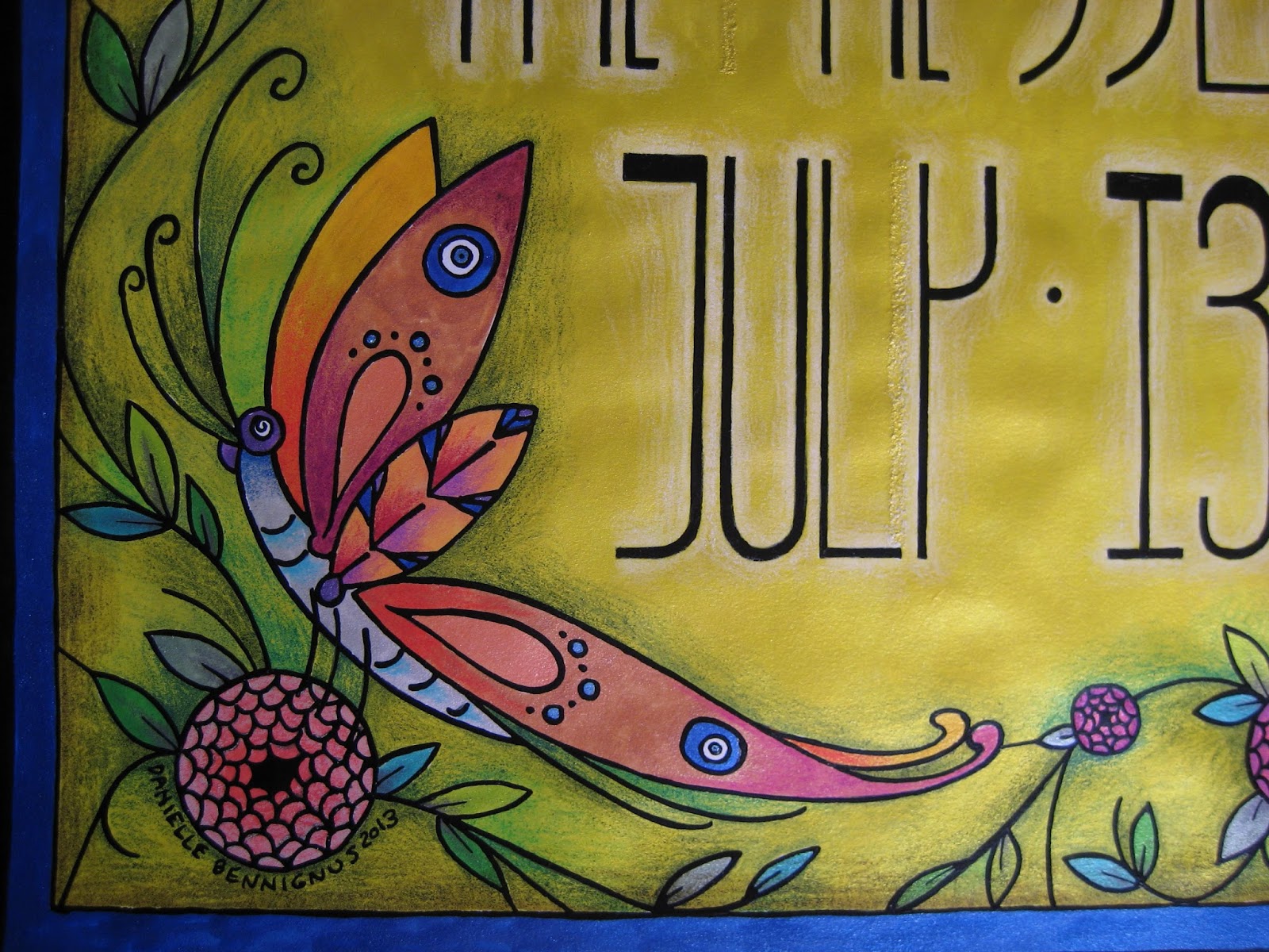
Anyhow.  This poster was a real joy, not only in that I took the easier route with metallic ink throughout, but also because we decided to increase our standard poster size from 8 1/2 x 11" to 11 x 17".  This freed my mind and hand up immensely, allowing much more room for design.  I had recently been reading about Louis Comfort Tiffany, and his stained glass creations clearly affected the thing.  The butterfly, as with so many other features in my work, offers Nazar Boncugu references in its wings.  (Also, if you look closely alongside the "y", you can see a correction/repair made, as my often-distracted mind initially thought an area that shouldn't have been inked... should.  X Acto blades and patience are absolute necessities when this lamentable situation occurs...)


I chose to embrace the vertical nature of the dimensions, and went with somewhat Mackintosh-inspired lettering.  Super Black on bright yellow ink, with white pencil shading behind the figures to help things pop.  You can see the reflective mica in the photo below - more of that to come...


Bees.  Our household is rather nutty for these beasts, as they have long flocked to the datura wrightii plants that have followed me through several moves.  In this case, however, they have to make do with Beardsley-inspired "fish scale" roses...


An angled shot of the poster, to show a bit more of the reflective nature of the metal-based inks.  Between the vividness of the inks, and the layered shades of the pencils, the resulting color reminds me of nothing so much as Liquore Strega (a favorite).  Granted, this sheen doesn't show up in the reproductions we distribute throughout town, but the intense colors come up beautifully.  There is also something rewarding about their visual appeal, on pieces I decide to frame... at least, unless they are hidden behind another piece within that frame.  Seeing this one again, it's probably time to give it the greater honor of actually being shown...


My best wishes always, and stay tuned for the next poster.

Sunday, April 17, 2011

Orchestra Banners, Volume 2

I mentioned in a recent entry that I had a little update, regarding the Slingers banner - here it is, in a wonderful photo taken at the recently restored Kessler Theatre. If you can look past Matt's fantastic 1920s Odd Fellows robe, you'll see the set of six stand-flags that I designed and executed. They come from the same panels of surplus velveteen and crushed velvet as the original orchestra banner (standing faithfully in the rear) - just smaller versions, focusing on the lotus flower element. I would have gone with an initialed concept, but seeing the letters "SS" just might not have communicated the positive vibe I was going for...

As with the banner, the flags were initially designed on newsprint, which was then cut into a template. After much cutting and pinning, the layers were sewn by machine (my much-beloved Pfaff 7550) - finished, they are secured to the music stands with velcro. I'm very happy with how they turned out, adding yet more vintage character to the performances.

I'm currently working on a couple of costume projects - once ready, I'm eager to post photos here. Once again, keep your eye out!

Wednesday, December 1, 2010

A Night in the Orient

How could I have forgotten this latest illustration? I meant to post this in my last entry - the advertisement poster for the recent, aforementioned "Night in the Orient" concert. Everything but the photograph and banner font was hand-illustrated - with luck, I will post close-ups in the next entry. For now, enjoy this peacock-focused flight of fancy!

Tuesday, November 30, 2010

A Sheik, His Sheba, Several Skulls... and an Aerialist!

So, after a rather longish absence, I've returned with the final version of the earlier post - my trapeze artist, part of a local opening in September. The last entry showed the "bones" of the matter - here she is in finished form. As is my standard practice, I used Prismacolor pencils with pen and ink - there are also details of tinsel and metallic ink. A close up of her face:

She was a delight to work on - the colors are joyous, and the subject matter consistently brings a smile to my face. Happily, I'm currently at work on several other illustration projects - to be posted here, naturally!

And now, I present the Sheik and his Sheba...


Matt's orchestra, the Singapore Slingers, held a truly landmark concert on November 19th: "A Night in the Orient" - an evening devoted to the Orient-inspired popular music of the 1910s and 1920s. We both knew that he needed a suitable sheik's robe for the event - and rather than rent one, I felt it would be much wiser to make him one. After much searching through the racks at local fabric shops, fate arrived in the form of a Moroccan festival in a neighboring town. We snapped up beautiful woven blankets, an embroidered shirt and leather slippers - and I got to work. Thanks to an older (and relatively accurate) costume pattern, I made his robe, and fudged my way through his head scarf and zarouelles (draped pants). I couldn't have been more thrilled with the results, to be honest - and luckily, I was able to dress accordingly myself, in a ragtime-era costume I'd made two years ago. Here's another photo of Matt in action, during the show...


On other sewing fronts, I bumped into a fabulous remnant of material - just in time for Dia de los Muertos:


I had just enough to put together a 1950s reprint pattern - a circle-skirted, sleeveless dress with bias-tape shoulder bows. It's an ingenious design, and I get complimented every time I wear it. Here it is on the form, to give an idea of length and drape. If you look to the right, you can see the adorable doll I made about 12 years ago, during my time in New York City. He's based off of my illustrations, and has been a well-dressed traveling companion ever since. Someday I'll devote a blog entry or two to his creation - it was a remarkable experience.

So there you have it, at long last - the blog has been updated! Stay tuned for further news, no matter how soon or how late... I'm bound to stop by. And thanks for your patience - as I manage to become better organized with each passing project, things will pick up again on the posting front. Best wishes - and happy holiday preparations to all!

Thursday, September 2, 2010

Life Savers, Each and Every One


In keeping with my last entry, I wanted to post a photograph of my latest poster - aimed at the greyhound community, but more so, toward honoring fosters. Across the country, many retired greyhounds spend time with caretakers trained to help them transition from their prior lives (as racing animals) to their future, as family pets and companions. These caretakers, "fosters", are invaluable in the adoption community - they ensure the successful adjustment of these wonderful dogs, helping them to understand aspects of life such as house rules, climbing stairs, avoiding glass doors - many of these things are completely alien to greyhounds just off the track. Fosters give them the gift of a future... a new life.

This poster is one that I'd been wanting to work up for some time - I appreciated the idea of fosters truly being "life savers", and as such, I pursued a nautical theme. The life ring itself was a given - what I hadn't planned on was the metallic lettering, and wooden scroll. But the more I thought of the incredible carvings I'd seen in maritime museums along the east coast, the less I could resist incorporating that element. The gold lettering falls into that vein as well - the 16th-century galleons featured vast amounts of skillfully-applied gold leaf. In short, this was a great deal of fun to create. Some detail photos - the last of which was taken up close, and at an angle, to show the textures of the pencil and inks.


I hope to have this poster run into a series of prints very soon - along with my other work now on Etsy, I think it could do a lot of good in raising further funds for the Greyhound Adoption League of Texas, as well as other groups down the line.


And if you're wondering, the two dogs are Desiree, my late fawn girl, and Martin, a very special brindle boy from the Fort Worth seizure, mentioned in the last post. Their fosters, Lynne and Holly, are both wonderful people, tireless in their efforts to help animals adjust to a happy future. This one goes out to both of them.

Thursday, April 22, 2010

The Plate is Rather Full...


... but I thought I'd drop by, and provide a couple of updates. First off, the new Singapore Slingers CD is in the final tweaking stages - Matt is polishing up the last of the liner notes, and the illustrations for the cover are complete. A touch of digital magic, and the separately-drawn album title will be added to the cover. I am distinctly fond of the results - like the last warm breeze of an Indian summer, the colors and lines are fluid and soothing. I can't wait to see the CDs arrive in early May, finished and professionally-manufactured - once that happens, I'll post the illustration (and ordering link) here. It goes without saying that the recordings are downright delicious.

Over the coming week, weather permitting, I'll be working on the hand-painted sign project that came along recently. Up to this point, the progress has been on paper exclusively - making certain that my client is happy with the overall appearance, before enlarging it to a 4 x 11' exterior painting. If I fail to update the blog over the next week (or two, should it rain), it's likely I'm spending more time on a scaffold than I had expected. Of course, the payoff is that I'll post the results here - and while the project is very basic (simple white-on-red letters/numbers), I'm sure to be proud of it. If nothing else, it will give me the opportunity to use elastomeric paints - and I am very excited about that.

Friday, April 9, 2010

Home of the Whopper

I know I've mentioned (and posted an illustrative photo of) the anole lizards that inhabit our front garden. However, this one warrants an entry of his own, alongside news of today's commission. This fellow is named "The Whopper", as he outsizes - by far - every other anole on the porch. At about 7 inches in length, he holds quite a bit of sway - often providing us with theatrical displays of territorial wackiness (doing push-ups and fanning out his throat). His presence on this blog might seem removed from the illustrations I do, but honestly he fits in perfectly with my work. Alongside the roses, kalanchoes, voodoo lilies and sacred datura plants I nurture every day, he plays a wonderful role in my little garden, which constantly inspires me.

And now, to the commission - thanks largely to a friend here in town, I will soon be working on a large-scale sign/mural. While simple in design, the process of executing it will feel wonderful - I love working with enamels. I can't wait to get my hands on some One Shot...

Tuesday, March 30, 2010

Shades of Coney Island


It's a gorgeous day in Dallas - in the 80s, with only a few clouds. Bright, blue and inviting for gardening, and - pleasures new to me - running and cycling. As I stretched out with Brick (our greyhound) in the backyard earlier, my thoughts turned to Coney Island, where the Polar Bear Club swimming season is drawing to a close. And as much as I enjoy this early warmth, I do miss the chilly spring season in New York City, and the thrill of seeing that very special Brooklyn shoreline come to life.

The sign posted above was one I created four years ago, that sat atop Steve's Grill House on the Riegelmann boardwalk and Stillwell Avenue, in Coney Island. Steve's is the unofficial summer home of the Club - even in the crowd-laden season the Bears are there - sunning, swimming, enjoying a beer and discussing, well... what Bears discuss. Steve wanted to do a little boasting of the honor his restaurant holds - Polar Bears are held in relatively high regard on Coney... heck, in NYC itself. Not everyone can withstand those frigid Atlantic dips throughout the winter.


Much like the banner I worked out for the Singapore Slingers, this one started out on paper, to be graphed out and enlarged. The final sign was eight feet long, and painted with One-Shot enamels - and my, they were heavenly to work with. The work was done in my dining room, then the sign delivered on-site.

And now, I'm off to hunt for a great photo of the sign on the building, complete with the 2006 Polar Bear Club marchers in the Coney Island Mermaid Parade in the foreground - until then, here's a favorite of mine. I'm in the top car of the Wonder Wheel, after the parade. My good friend Nathan Brown and I had decided to take a spin, and as we neared the crest of the Wheel, a torrential rain broke out. I grabbed my umbrella - Nathan grabbed his camera. Enough said. Have a look at his other pics at www.cyclonic.smugmug.com - his level of amusement park fanaticism is even higher than mine. Enjoy!

Saturday, January 30, 2010

Rough Stuff... on a Highwire, at That


Tonight, I'd like to do something rather uncharacteristic...I'm digging into my sketchbook, to expose a handful of rough thumbnails. These were created as part of a project I worked on with my good friend Brian, a New Jersey high school band director. The theme he had chosen for the annual competition show was "Under the Big Top", and three sideshow banners needed to be made.

As time was limited, I chose to forgo the traditional route of hand-painting on canvas, in favor of illustration that could be expanded vastly, and digitally-printed on vinyl panels. The result was a great deal of fun, and I honestly regret that the banners are still in the possession of that school district.

To be honest, in retrospect I actually prefer the colors and rickety nature of the thumbnails, to those of the finished drawings. I am deeply fond of "cleaning up" my work for the purpose of final appearance, but I just may have to do a project "in the rough", so to speak, allowing the character to shine just as it is. For the sake of comparison, I'll add two photos of the finished pieces, as they hang at my bedside. To prevent odd inquiries, yes, those are antique hats. The theatrical one with the feather is a circa 1920s Odd Fellows Hall uniform piece, that I restored and trimmed out with peacock and antique jewelry - Matt wears it during oriental foxtrot numbers at the Singapore Slingers performances. Quite a couple, I assure you...


Thursday, January 14, 2010

Twin Souls - the Joy of Being Found


Tonight, as promised - a continuation on the theme of musicians. I've decided to take a brief rest from illustration, to show off a different side of my creativity - one that, although not physically related to drawing, has everything to do with my inspiration. Ladies and gentlemen... my name is Danielle Bennignus, and I am Charleston-Mad.

Matt Tolentino, my darling and muse, directs an 18-piece fox-trot orchestra - the Singapore Slingers, dealing mainly in popular dance tunes of the 1920s and early 1930s. He is rightfully very proud of the group, as they have graced the Dallas music scene for well over a year. I love him for it, as many of their signature pieces would likely have fallen through the cracks of American culture - the Slingers are keeping some absolutely wonderful works alive and well. Aside from the simple fact that I love listening to this genre of music, I love dancing to it. As tonight's blog title suggests, I truly feel as though I've been found - by a man who understands my archaic, borderline obsolete interests - Twin Souls, to be sure. And so, it really was only a matter of time before Matt and I collaborated, and put on an act like the one in the clip above.

I learned to do the Charleston years ago, during my time with the Flying Cloud Academy of Vintage Dance in Cincinnati, OH. Joan Walton, a wonderful dancer, taught me to do the dance with enthusiasm and precision - the late Patri Pugliese showed me steps I'd never seen before, that he learned from his mother, who had been a champion exhibition dancer in the 1920s. I try to be authentic in my steps, and roll out all of the gusto I can muster - the way it should be. So, the opportunity to perform "Nagasaki" with the Slingers was welcome, indeed. This is one way in which I can pay tribute to my Matt - his work, as well as the efforts of every member of the orchestra.

In the clip, you can see Matt directing the group, as well as megaphone-singing, with me on the stage behind. On top of that, the velvet banner that graces the stage's right side was made at home - I designed, scaled, laid out and sewed it from the ground up. A Christmas present for the love of my life - but as well, an illustration project, only in this case done in fabric, rather than paper.

There are other such projects I've worked on - costumes, millinery, window displays, etc, which will make their way into the blog. Despite my frequent focus on the drawings, there is so much more to see... I thought this would be a wonderful way to introduce some of the other work that I do. And so, yes - again - here's to musicians - and tonight, to the one who holds my heart.

Tuesday, January 5, 2010

In a little room serenaded by ragtime...

... I sit down to create a new beginning - a new way to show the world, well, My world. Though I have a website of my own, I feel that this will be a much more interactive way to let folks know what's going on - both on the illustration front, as well as in the life that inspires my work. Welcome to the Bennignus Blog.

With each new post, I'll do my best to feature a piece of work - recent, and focusing on my illustration. It's what I'm mainly known for, although other projects will sneak in from time to time - costumes, banners, household wackiness and much more. There's no point in creating a world, if you aren't eager to share it with others.

Likewise, feel free to share your opinions, suggestions, questions and more with me - I'm the friendly sort, and love to hear from folks. However, Please Refrain from click-drag-copy-usage-etc of my work. I'm very protective of what I create - if you're interested in using my work, please contact me directly. This stuff takes a lot of thought and practice to execute - as well, it is protected by copyright.

And so, away we go! Please enjoy my blog, and don't hesitate to speak up...