Showing posts with label costumes. Show all posts

Saturday, December 17, 2011

Another Year, Another Poster!

Just in time for the holiday season, we will be distributing copies of this poster throughout Dallas, in preparation for our New Year's show at the Kessler Theatre. This is one of my favorites so far, with some new technical twists that I wouldn't have thought of in earlier projects. For those new to Brave Combo (who we are thrilled to share the stage with for the evening), they are a much-beloved group from Denton, TX... and it's very difficult to categorize them. Nowadays, they focus largely on what I would term "fusion polka", incorporating classical, jazz and rock elements into the dance tempo. However, their influences and practices go far beyond that - my first exposure to them was thanks to their collaboration with Tiny Tim, for their album, "Girl". Anyone who appreciates the late, incredible Tiny is good people in my book. But on to the drawing. Let's have a look!

The whole idea here was to connect the Germanic (polka) with the Freewheeling (jazz) - what better way than to feature two pin-ups, toasting the beginning of the new year? My Teutonic cutie sports lederhosen and miesbacher hat, trimmed in a somewhat unorthodox gamsbart. With a characteristically teeny waist and shapely legs, she proves that lederhosen can be sexy. A look at the metallic scroll on the steel-colored garment...

I've said it so many times... I love metallic inks. The mica pops right off the surface of the drawing, and the relatively even nature of the liquid allows for clear, strong delineation of details. It just hums among the more muted pencil. And now for our jazz belle...

Of course, she's a redhead. I figure that I'll likely be doing most of the Charleston dancing that night, so why not? The only caveat - I just wish I had a beaded dress like this one! I shamelessly detest the cheap, historically-insulting fringed "flapper" costumes that have flooded the market since, oh, 1955 - but beaded strands are more than good by me. Hell, I have a circa 1912 evening gown with just that trim all down the front - appropriate is the word. Our girl holds a champagne glass, whereas her cohort prosts with beer - a happy cultural blend.

And now, a look at my favorite aspect at play, the colors!

I've learned over the years that, despite my gratefulness for a steady-ish hand in terms of pen and ink, the color palette I adopt tends to find itself, and evolve over time. Sometimes it's brash, often soft, here and there in-between... it just happens on its own terms. This time around was no different, but I tried a new technique, to help the girls and central timepiece stand out. Over a base of numerous metallic inks, I did a bit of color shading and white-washing, to mute the tones down. What I ended up with reminds me somewhat of the great traditional fairground painters, such as Sid Howell and Fred Fowle. If I haven't mentioned these all-too-often overlooked artisans, Please Look Them Up. They were masters of leafing and painting techniques, highly respected in their time for their work on early English amusement rides. I would be tempted to give any number of toes for the mastery of what those men were capable of...

Anyhow, away from such gruesome praise! I hope you've enjoyed today's entry - I only hope that it won't be the last this year! But, just in case, here's wishing you a wonderful, prosperous, healthy and happy...
... and Many Happy Returns!

Matinee Melodies


Granted, I apologize for this being a touch late to the party - but at long last, I present the poster for our last show, "Matinee Melodies". This was a program celebrating the music of 1930s Hollywood, so I went with simple black and white, with a cinematic theme. Let's have a look at our model...

As Norma Desmond famously said in Sunset Boulevard, "We had faces!" - and I quite enjoy this lady's coy countenance. She holds her trusty Western Electric carbon microphone, although the cord isn't attached to the element - the magic of illustration, in favor of a better line! Her evening gown is cinched with film, that cascades into a train, circling around the perimeter of the drawing...

A lot of fun, as I love to work with long, fluid curves. The "Matinee Melodies" lettering is actually India ink on white bristol - I prefer to let the paper itself show through, rather than use white ink on top. You can see how rough the inked surface is here...

And finally, a little detail - one of her feet. Just short of being indicative of a fetish, I love feet, and get a kick - no pun intended - out of drawing them. Heels, pointe shoes and slippers in particular have a power over my pen, sneaking in at every opportunity.


What else do I like? Seeing these lines so close-up. I tend to get lost in the moment when I'm working, and miss out on how India ink plays with the almost-smooth surface of bristol, like a funny ballet between the weight/control of my hand, and the unique character of whatever nib I'm using at the moment. And trust me, no two are alike - not only in terms of makes and models, but individually. It's a pain and a joy, working with such temperamental tools.

Up next - the antithesis of this drawing, a veritable orgy of color! Stay tuned!

Sunday, September 18, 2011

If At First You Don't Succeed...


Welcome back, friends! It's Oktoberfest season, and do I ever have an appropriate entry this evening. Matt's Czech polka band, the Royal Klobasneks, are in full two-beat swing this time of year - what better excuse for a new costuming post? Despite the current leaning toward polkas, sausage, beer and festivity, my thoughts have been focused almost entirely on sewing... and my ongoing longing for a dirndl.

Now, I should explain tonight's title. About a year ago I had attempted, via a Butterick costume pattern, a "stand-in" dirndl - a basic Renaissance bodice and full skirt, complete with boning and a fully-laced front closure. It wasn't a great success - binding in the chest, and downright uncomfortable. The main complaint was that it didn't perform like an Austrian dirndl - in other words, it didn't slope off at the breast level, and rise to create the traditional shelf at the center. I salvaged the skirt, but the bodice was a wash.

This season, I decided to take the bull by the horns, and do this project correctly. I can't imagine how many hours I spent researching dirndls - their silhouette, tradition, history and, most importantly, construction. Initially I turned to Folkwear, hoping that their dirndl pattern would do - but was disappointed with the results otherwise skilled sewers had come up with. Worse yet, the pattern involves a dart at the armpit - a serious no-no, unseen in authentic examples. I decided to utilize Folkwear for the blouse, skirt and apron patterns - but the bodice would have to be engineered on my dress form, from start to finish. First of all, two photos of the finished garment, to show the overall silhouette I was aiming for...

The bodice is the main element I'll be talking about here, but I'm very happy with the overall design. Before I delve further into the construction details, I'll mention that the fabric is a remarkable cotton I found at Joann's - I didn't pre-wash, preferring to retain color and clarity at the expense of dry-cleaning. The apron is a quilting cotton, and the blouse is simple white cotton, with soft blue polka dots - trimmed with eyelet. My socks are German, as well as my Tyrolean hat (a gift from Matt).

Now on to the guts of the thing. Adjusting my dress form a size or so downward, I used pins to delineate the curved edges of my bodice, along with the curved back seams, and subtle front seams. While making a muslin dummy I discovered that most of the shelving up front happens at those two front seams, only several inches from the center - there's the slightest bit of give as the join reaches the top, just near the widest part of the chest. Here's a close-up, showing that tiny outward curve...

As well, the interior of the front and center, lined with alternating hooks and eyes. This is a trick I learned from studying and collecting Victorian-era garments - regardless of how the wearer moves, the closure won't give. Many dirndls utilize a heavy zipper for this front closure, but I wanted the fabric design to match up perfectly when brought together. Another interesting point regarding the closure has to do with the structure - while I usually turn to featherweight boning for milder bodice work, this time around I needed something stronger. I frankly didn't want to bother with steel boning - I wasn't completely sure of the length I would need, and had no desire to spend a large-ish amount of funds guessing. I read on a sewing blog (I wish I could remember which!) the perfect item for such a job - heavy duty cable ties. I bought a bag of duct-strength plastic ties, and cut two down to suit the final length. I then sealed the cut ends with electrical tape, so there would be no cutting through the fabric, a typical problem with boning. The result is fantastic, and will be repeated in future corsetry projects.

This photo brings up two neat points - the quilting of the inner and outer materials, and use of bias tape. I lined my dirndl bodice with duck-cloth, to reduce the stress overall, and absorb perspiration. To reduce the separation between the two, I quilted the fabrics together - a detail is shown below. As well, I used bias tape to seal up the seams inside - this is an old practice that I tend to use in corsetry and Victorian costuming. Outside of the center closure, there is no boning in the dirndl - so much depends on the seam placement and "give". The photo below was taken after two days of wear, and shows the stress points along the back seams...

A flower in the print, showing the quilting method I used...

Matt and I together, with a somewhat skewed blend of smiling (him) and staunch (me)! The bodice is finished with cotton cording throughout the seams and edges, a conservative substitute for the often elaborate trims that grace many dirndls. The apron features a new technique to me, shirring - rows of small gathers along the top edge, just beneath the tie. I did this on my machine, using a zig-zag stitch and buttonhole twist thread - the bottom of the apron has horizontal pleats and machine embroidery. Underneath it all, the hem is reinforced with crinoline, and I'm wearing eyelet-trimmed, seersucker drawers - patterned directly from a pair dating from the early 1900s. As I'm (very happily!) married, my apron is tied on the left.

I'll admit that this was initially one of the more intimidating projects I've tackled - I wanted to do justice to the dirndl, and find that balance of comfort, while flirting with constriction. Although I could have purchased a ready-made piece, I wanted the fit to be perfect - no gaps, no heavy binding... and without need of alteration. Our good friend Valina (who, with her husband Ross, perform as "Das ist Lustig!") helped me move forward on the home-made route - her mother makes her performance dirndls, unhappy with the modern ready-made examples. Her construction advice was most useful, and gave me the courage to invest in the needed materials and Do Something. I'm thrilled with the results, and look forward to more Royal Klobasneks shows this season, and in the years ahead.

To you all, Ein Prosit der Gemutlichkeit!


Saturday, August 27, 2011

Fur and Foliage: An Autumn Treat

It's that time again - another Singapore Slingers concert is around the corner, and nothing gets the word out around town so well as a playful poster. This time the theme is "Fall Frolic", taking a cue from the seasonal college parties of the 1920s. To me, Fall brings forth thoughts of falling leaves, and plenty of squirrels. And considering I used to have a good friend who happened to be a squirrel, this illustration brought back some great memories. Let's have a look at two profiles of these arboreal wonders...

The two featured here get the musical treatment, appropriately enough - a somewhat Dixieland theme, resplendent in peppermint-striped vests and straw boaters. While I'm personally more familiar with the Northern Grey Squirrel crowd, I added a touch of terra cotta pencil to these fellows, as Red Squirrels are the common Dallas variety. Our trumpet player...

Of course, plentiful use of metallic ink is at play here - short of the squirrels themselves, nearly the entire surface of the bristol is layered in it, along with colored pencil. I greatly enjoyed working on the leaf, trying out a good handful of varying tones on top of the copper ink...

... A simple, nutty detail...

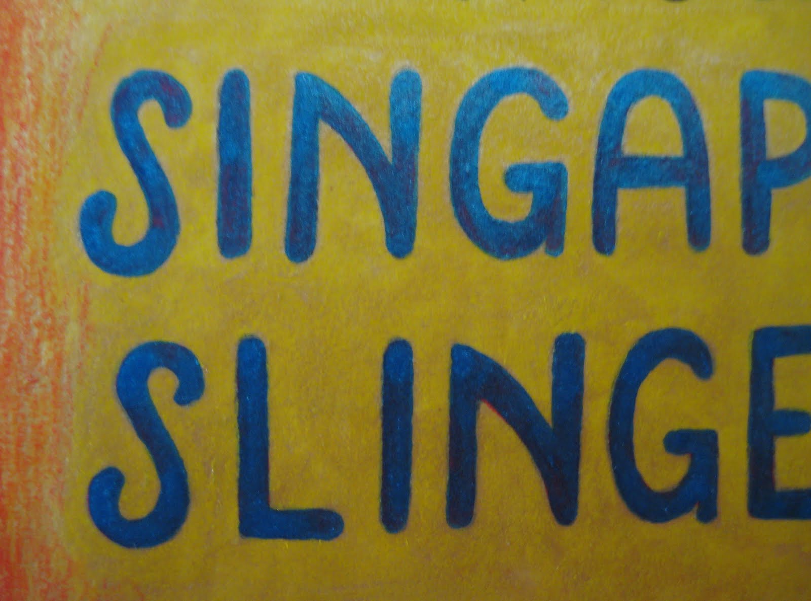
And at last, an unusual, un-bordered font. A minor departure for me, as I almost always line words out with at least a thin, solid black border - in this case, I went for a somewhat "neon sign" appearance.
Finally, several words of good news - the Slingers will be playing on September 23rd with jazz legend Leon Redbone, at the Kessler Theatre in Dallas. As well, the orchestra has been nominated in the Best Jazz Group category of the Dallas Observer Music Awards - hop by their website and place your vote! We're honored by the nomination alone, but to win would be truly wonderful.

Look for further updates - I will be working on a new poster for the aforementioned Leon Redbone show, and creating new stand flags for Matt's Czech band, the Royal Klobasneks. Plenty of illustration and sewing lay ahead!

Sunday, June 26, 2011

Posters, Past and Present

Although I'd planned on an entry featuring our current event illustration, just as I pulled out the camera for several close-ups, I realized that I had completely overlooked the last poster! Inadvertently late, here's "Sunshine and Shadows", from our May 24th Depression-era program.

As usual, I had a lot of fun coming up with a new font...

... and I've been enjoying the heck out of illustrating gentlemen again. The recent posters have been largely female in nature, so, despite how trim and often androgynous my gents tend to be, it's still been a joy to draw them.

As well, I decided to throw in the sunshine itself, with a distinctly 1930s personality. I'm not usually prone to anthropomorphizing (well... animals, yes - otherwise, no), but the idea of a chipper, look-on-the-bright-side-and-pull-up-your-bootstraps sun, tossing coins down to the thread-worn populace, was too tempting to pass up. Maybe the dancing musical instruments in the last poster started a trend...

And now on to the current poster, advertising our Patriotic Revue. For the longest time, Matt's been aching to break out the Sousa arrangements, and what better time of year to do so than July 4th weekend?

Although I didn't want to come across as too jingoistic, I knew that a bald eagle would have to make an appearance...

... and instead of heading completely into traditional American flag turf, I decided to incorporate olive branches and arrows, as frames for the evening's musical offerings.

The center shield reminds me of a simplified carving one would find on a carousel rounding board (I couldn't avoid fairground references, regardless of how hard I could ever try)...

In all, a continuation of the tried-and-true pen, ink and pencil practices I've stuck with for so many years. In the next blog, the working materials are of a completely unrelated nature, although entirely associated with the usual subject matter. A little hint:

... See you soon with more goodies!

Saturday, May 7, 2011

Bees, Buddies, Moths and Schmidt... Revisited

Earlier this week, Matt and I took a couple of days for a return visit to one of our favorite places - New Orleans. This time around, we were lucky enough to meet up with some truly wonderful friends, all just as vintage in musical and artistic tastes as we are - Blaine, a Louisiana native (who has a level of adoration for NOLA that defines infectious), and Richard, who is both a traditional jazz nut and highly respected pioneer in Coney Island preservation. His charming wife Liz joined in the festivities, and all had a hell of a lot of fun. Despite our many new discoveries during this visit, I woefully took only a couple of photographs - frankly, I was enjoying the sensory experience far too much to bother with my camera. But the two photos I did take are gems, and are posted here.


In one of last year's posts I mentioned George Schmidt, and all that his presence encompasses - so it shouldn't come as a surprise that we spent a bit of our visit with him. He's working on a handful of beautiful pieces for an upcoming show - I should have taken photos... I repeat my reasoning, regrettably. One in particular featured one of the finest representations of greyhounds I've seen in a long while - my adoption friends would have loved it. This time around I presented George with the sheik's robe I had promised him - it matches Matt's, and was very well-received. I was delighted when Patty, George's wife, showed just as much appreciation for it as he did - but after all, the ultimate Pharaoh of the Oriental Fox-Trot certainly deserves such a gift. Looking at these photos again, I'm reminded of how gracefully he uses his hands - my late mother was a fiend for hands with character, and would surely have been a little nuts for these. A born artist, to be sure.

And now, for a little update from the home front, and the little garden that graces our porch. This year the star attraction has been the Sacred Datura plant - it's in its second season, and coming up like gangbusters. The honey bees in particular have taken an enormous liking to it, crowding around the blooms at sundown.

Granted they are large flowers, but to see seven bees busily gathering pollen in a single blossom is pretty incredible stuff. The above photo still surprises me. Of course, bees aren't the only visitors we get - I'm almost certain that this is a tobacco hornworm moth. Regardless of its specific name, the thing was enormous, fooling us into believing it to be a large hummingbird. Just compare it to the bees in size - that should give you an idea!

Finally, more for the hell of it than anything else, a little photo of Brick and Doo-Dad. Each day that passes makes me prouder of them both - Brick for learning to share his home after some years of single-hood, and Doo-Dad for finding his place in our family, and respecting Brick's limits of patience (being a senior pup and all). Seeing these two fit into brotherly roles brings me a lot of happiness - I figured I'd pass that cheer along.

As a little side-note, I'm really looking forward to seeing what NOLA's influence brings, sewing and illustration-wise, this time around. Visiting several galleries and clothing boutiques was inspiring, to say the least...

Sunday, April 17, 2011

Orchestra Banners, Volume 2

I mentioned in a recent entry that I had a little update, regarding the Slingers banner - here it is, in a wonderful photo taken at the recently restored Kessler Theatre. If you can look past Matt's fantastic 1920s Odd Fellows robe, you'll see the set of six stand-flags that I designed and executed. They come from the same panels of surplus velveteen and crushed velvet as the original orchestra banner (standing faithfully in the rear) - just smaller versions, focusing on the lotus flower element. I would have gone with an initialed concept, but seeing the letters "SS" just might not have communicated the positive vibe I was going for...

As with the banner, the flags were initially designed on newsprint, which was then cut into a template. After much cutting and pinning, the layers were sewn by machine (my much-beloved Pfaff 7550) - finished, they are secured to the music stands with velcro. I'm very happy with how they turned out, adding yet more vintage character to the performances.

I'm currently working on a couple of costume projects - once ready, I'm eager to post photos here. Once again, keep your eye out!

Sunday, April 10, 2011

Fun with Folkwear

This summer I've taken it upon myself to review and strengthen my sewing skills, reaching outside of my prior comfort zone with new patterns, fabrics and techniques. The Slingers banner posed new design challenges (more on that with an update to come) - this time around, I couldn't help but play with wispy textiles. When I saw this wonderful, Art Deco-inspired yoryu fabric in the clearance section of Joann Fabrics, I knew I would finally work on a pattern I'd longed to approach: Folkwear #214, a 1927 tea frock.

The design is very simple, and offers several options - long or short sleeves, collar or no collar, smocking or a flat drop-waist, as well as period-correct embroidery patterns. I decided to go with short sleeves (they're like fluid little wings!), and the basic waist - adding a sash to the left side, thus concealing the closure hooks and snaps. It had to be cool and free-flowing for dancing, as I'm gradually retiring my fragile vintage pieces, in favor of dance-friendly new ones. I performed on April 8th in this, and it is Ideal for the Charleston. The yoryu was a joy to play with, especially once I'd figured out the secret of sewing sheer fabric on top of newsprint - it made the work immensely faster and easier!


The cloche is an original, circa 1927-29, found at a wonderful estate sale on Eastern Avenue in Cincinnati, OH back in the early 1990s. These photos were taken at a garden party today, at our dear friend Rawlins Gilliland's beautiful home - Matt and Tom Pecena (a great friend, as well as my dance partner) were happy to pose for these photos.

I'm certain there will be more costumes to come - I recently bought a slew of reprint patterns from the 1910s -1930s, and expect this summer to be busy! Stay tuned...

Friday, February 18, 2011

Getting the Word Out


The weather is finally beginning to break, my jasmine plants are sprouting forth new leaves, our pups have a little extra bounce in their step... as such, I couldn't resist cherry blossoms, rose bushes and parasols, as demonstrated in today's blog illustration. (But first, a closer look at our model's lovely face, framed in a straw cartwheel hat. I'm a stickler for delineating woven details...)


With the resurgence of springtime here in Dallas, The Singapore Slingers are putting on two Valentine-centric concerts - and naturally this brought forth my illustrative tendencies. I'm so pleased that Matt enjoys and nurtures my work, encouraging me to create posters and announcements for the orchestra - to say that this kind of work feeds my spirit is an understatement. (Another peek at those tasty cherry blossoms...)


The Slingers are currently in a stage of wonderful growth, following a recent article in the Dallas Morning News. More press equals more listeners, and the last couple of shows were sold out completely. This weekend (in the second listing on the above poster), they will be performing for the first time at the Kessler Theater, a restored, early 1930s movie house, complete with a beautiful dance floor - a rarity at Slingers shows. With the ongoing increase in shows and followers, you can bet that more related illustrations are on the way - as well, more costumes. For instance, a certain lemon yellow length of silk is calling my name, aching to be made into a circa 1927 tea dress, ideal for dancing... meantime, enjoy the featured poster, assured that more good things are on the way. (And finally, we'll finish with feet. My underlying fixation on ballet shoes is never far beneath the surface of just about everything I draw...)

Tuesday, November 30, 2010

A Sheik, His Sheba, Several Skulls... and an Aerialist!

So, after a rather longish absence, I've returned with the final version of the earlier post - my trapeze artist, part of a local opening in September. The last entry showed the "bones" of the matter - here she is in finished form. As is my standard practice, I used Prismacolor pencils with pen and ink - there are also details of tinsel and metallic ink. A close up of her face:

She was a delight to work on - the colors are joyous, and the subject matter consistently brings a smile to my face. Happily, I'm currently at work on several other illustration projects - to be posted here, naturally!

And now, I present the Sheik and his Sheba...


Matt's orchestra, the Singapore Slingers, held a truly landmark concert on November 19th: "A Night in the Orient" - an evening devoted to the Orient-inspired popular music of the 1910s and 1920s. We both knew that he needed a suitable sheik's robe for the event - and rather than rent one, I felt it would be much wiser to make him one. After much searching through the racks at local fabric shops, fate arrived in the form of a Moroccan festival in a neighboring town. We snapped up beautiful woven blankets, an embroidered shirt and leather slippers - and I got to work. Thanks to an older (and relatively accurate) costume pattern, I made his robe, and fudged my way through his head scarf and zarouelles (draped pants). I couldn't have been more thrilled with the results, to be honest - and luckily, I was able to dress accordingly myself, in a ragtime-era costume I'd made two years ago. Here's another photo of Matt in action, during the show...


On other sewing fronts, I bumped into a fabulous remnant of material - just in time for Dia de los Muertos:


I had just enough to put together a 1950s reprint pattern - a circle-skirted, sleeveless dress with bias-tape shoulder bows. It's an ingenious design, and I get complimented every time I wear it. Here it is on the form, to give an idea of length and drape. If you look to the right, you can see the adorable doll I made about 12 years ago, during my time in New York City. He's based off of my illustrations, and has been a well-dressed traveling companion ever since. Someday I'll devote a blog entry or two to his creation - it was a remarkable experience.

So there you have it, at long last - the blog has been updated! Stay tuned for further news, no matter how soon or how late... I'm bound to stop by. And thanks for your patience - as I manage to become better organized with each passing project, things will pick up again on the posting front. Best wishes - and happy holiday preparations to all!