Showing posts with label Tolentino. Show all posts

Tuesday, December 22, 2015

Two Charmers


It's that time again - New Year's Eve is just around the corner, and that means just one thing - Another Poster for the Orchestra. This time around, I decided to let a sea lion play the starring role, balancing a ball upon his nose, ushering in the year 2016.


The usual parties are in attendance - linear lettering, metallic inks, plenty of shading and fun with color. It's a bold design, as confident as the traditional jazz played by the Singapore Slingers themselves.


For good measure, a nice close up of our main attraction, suitably attired in a sort-of-tux, appropriately fitted to his sinuous shape. As always, our New Year's Eve performances are a heady blend of elegance and tomfoolery - as such, this is a perfectly representative poster!


And now, allow me to introduce... Miss Luxe. She was designed for www.savoirluxe.com - a wonderful, Dallas-based consignment service that specializes in high-end designer clothing and accessories. The company's owner/director is the marvelous Mindy Loll, who is a force unto herself! She saw a small display of my prints at Vintage Martini, the Dallas vintage and designer clothing boutique, and immediately commissioned a "flapper, with touches of gold and silver". Miss Luxe will help represent SavoirLuxe, and I couldn't be happier about it.


 Miss Luxe's gold and silver elements are rendered in mica-based ink - the beading of her gown, plumage and champagne coupe are redolent with it.


Two new projects to finish off the year, with more around the corner. As you'll see in the coming days, there have been other pieces, as well - vivid, eclectic, playful and pleasing. You'll enjoy what's ahead.

To visit the fantastic shop now carrying my prints, see www.vintagemartini.com

For more information on Mindy Loll's company, please visit www.savoirluxe.com


Sunday, September 15, 2013

Garden of Pleasures


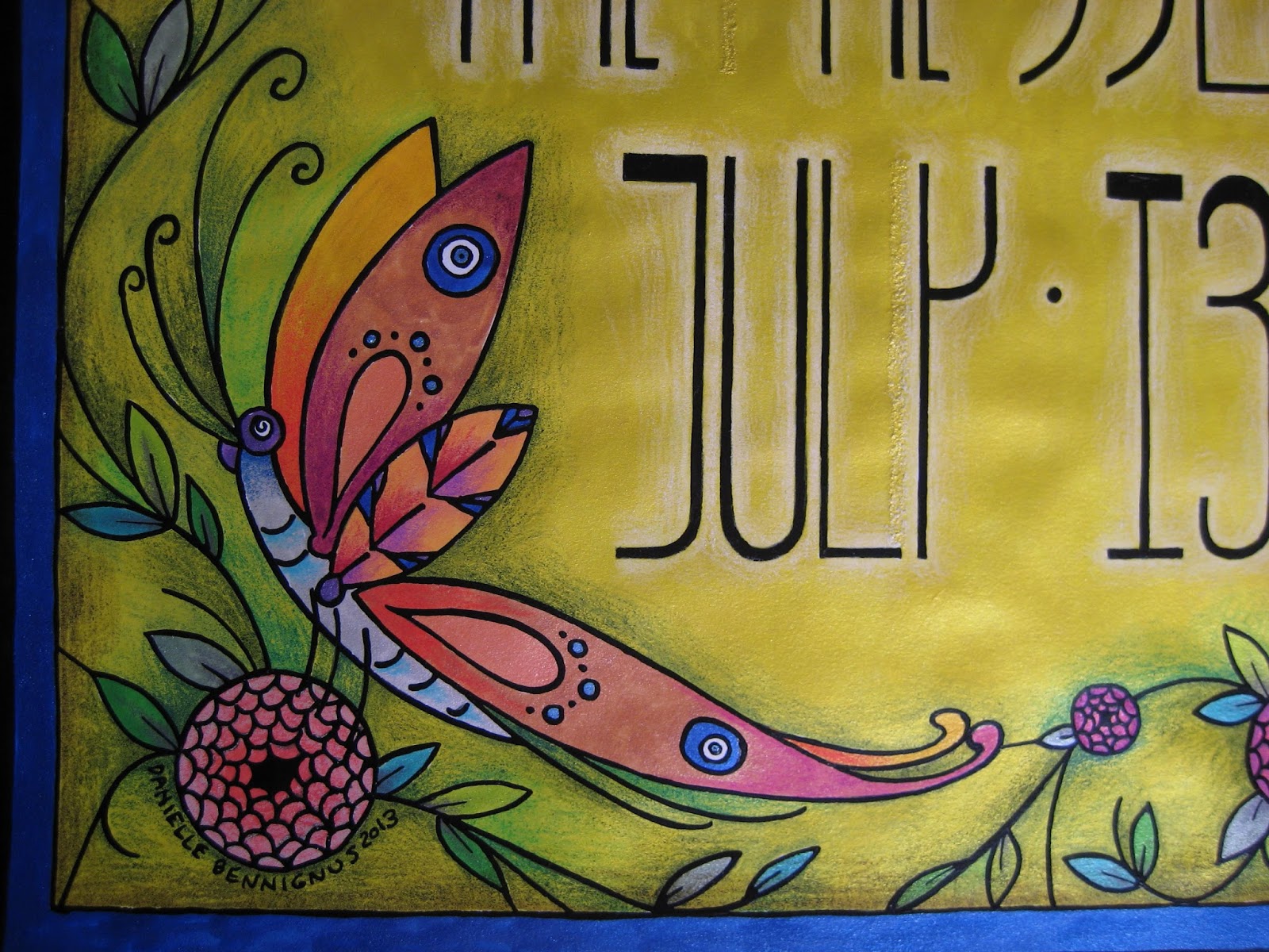
I have a way of driving myself somewhat crazy, in terms of procrastinating when it comes to posting new work on the blog.  This is a perfect example - the most recent Singapore Slingers poster, for an event back in July.  I kept meaning to photograph and document, but waited so long that I actually forgot where the original drawing ended up.  After a half-hour of frustrated portfolio-scanning, I recalled that it was hidden in a frame, behind another poster.  For safe-keeping, which is a great concept - but not so great when the location is forgotten entirely.  Safe, indeed...

Anyhow.  This poster was a real joy, not only in that I took the easier route with metallic ink throughout, but also because we decided to increase our standard poster size from 8 1/2 x 11" to 11 x 17".  This freed my mind and hand up immensely, allowing much more room for design.  I had recently been reading about Louis Comfort Tiffany, and his stained glass creations clearly affected the thing.  The butterfly, as with so many other features in my work, offers Nazar Boncugu references in its wings.  (Also, if you look closely alongside the "y", you can see a correction/repair made, as my often-distracted mind initially thought an area that shouldn't have been inked... should.  X Acto blades and patience are absolute necessities when this lamentable situation occurs...)


I chose to embrace the vertical nature of the dimensions, and went with somewhat Mackintosh-inspired lettering.  Super Black on bright yellow ink, with white pencil shading behind the figures to help things pop.  You can see the reflective mica in the photo below - more of that to come...


Bees.  Our household is rather nutty for these beasts, as they have long flocked to the datura wrightii plants that have followed me through several moves.  In this case, however, they have to make do with Beardsley-inspired "fish scale" roses...


An angled shot of the poster, to show a bit more of the reflective nature of the metal-based inks.  Between the vividness of the inks, and the layered shades of the pencils, the resulting color reminds me of nothing so much as Liquore Strega (a favorite).  Granted, this sheen doesn't show up in the reproductions we distribute throughout town, but the intense colors come up beautifully.  There is also something rewarding about their visual appeal, on pieces I decide to frame... at least, unless they are hidden behind another piece within that frame.  Seeing this one again, it's probably time to give it the greater honor of actually being shown...


My best wishes always, and stay tuned for the next poster.

Tuesday, January 24, 2012

Kitschmas!

Although it's a bit late, I thought I'd take the opportunity to share a view on our annual Christmas display - perhaps better termed a "Kitschmas Display". For a little over 15 years, I've put up my late 1950s aluminum tree, for two reasons. Firstly, because I've had an obnoxious weakness for the tacky things ever since I saw one for the first time. Secondly, in honor of my late mother, who surprised me on Christmas day with this tree... which happened to be the aforementioned "first vision". In her usual, thoughtful way, she timed the entire gifting process into a great production, involving drama, despair and a beautiful wind-up of relief and celebration. I don't think I've mentioned her often enough in this blog - she was the Real McCoy. On to the ornaments!

This is one of my long-time favorites, likely a Shiny-Brite dating from the WWII era. I recently learned of the company's practice of painted stripes on clear glass, a wise move during a time of rationing and conservation. In this case, less is more. It reminds me of Easter, with white, canary yellow and lilac tones.

My brother kindly sent me this beautiful 1950s flocked icicle piece, along with a slew of other vintage decorations. It's incredibly graceful and fragile as the dickens - pure in nature, likely being the most dignified ornament on the tree year after year.

During their years together, my parents gave each other Easter baskets, but tucked inside German paper eggs. This is a survivor, most others likely lost in moves, or crushed over time and under family records. Luckily, it's small enough to hang from the tree, not causing undue stress to the tinseled boughs.

A nifty Waterford seahorse ornament, reminding me of my happy years as a display technician at the company's Madison Avenue showroom. Waterford's mercury glass ornaments are like explosions of color, vibrating against the silver strands of this tree. No evergreen could show them off anywhere near as much. In the back, you can see a "Giddies" ornament design that I created for the company about 5 years ago, for a second collection that never hit the shelves. A shame, as they outdid the skaters designs hand over fist.

A nice little grouping, including the German pickle. Ours is ridiculously easy to find, thanks to its size and environs - at least we made the effort. Here you can also see one of our wooden pieces, as well as a Peruvian crocheted bird. A number of these more organic items came from the collection of Otto Thieme, the late, remarkable curator of costume, textiles and African arts at the Cincinnati Art Museum. Oftentimes I think of him and his guidance years ago, when I donated a Paul Poiret robe to the museum (another story for another day) - he is well remembered during the Christmas season, thanks to his ornaments.

Finally, our color wheels! Aluminum trees and string lights Do Not Mix Well, thanks to the risk of exposed metal against electric wiring. The solution? Rotating gel lamps, that cast alternating shades against the silver boughs. At night, it's a wonderful effect - and in this case, two are better than one. You can also see the incredible tree skirt that Matt's great-grandmother made by hand, likely in the late 1940s. Outside of many of the ornaments, most of the setup is original, from the wheels down to the tree itself, made by the Revere Aluminum Tree Company (model T-45). I hope you've enjoyed the little tour - I'll likely be revisiting this post come August, if this Texas summer is anything like the last!

Sunday, September 18, 2011

If At First You Don't Succeed...


Welcome back, friends! It's Oktoberfest season, and do I ever have an appropriate entry this evening. Matt's Czech polka band, the Royal Klobasneks, are in full two-beat swing this time of year - what better excuse for a new costuming post? Despite the current leaning toward polkas, sausage, beer and festivity, my thoughts have been focused almost entirely on sewing... and my ongoing longing for a dirndl.

Now, I should explain tonight's title. About a year ago I had attempted, via a Butterick costume pattern, a "stand-in" dirndl - a basic Renaissance bodice and full skirt, complete with boning and a fully-laced front closure. It wasn't a great success - binding in the chest, and downright uncomfortable. The main complaint was that it didn't perform like an Austrian dirndl - in other words, it didn't slope off at the breast level, and rise to create the traditional shelf at the center. I salvaged the skirt, but the bodice was a wash.

This season, I decided to take the bull by the horns, and do this project correctly. I can't imagine how many hours I spent researching dirndls - their silhouette, tradition, history and, most importantly, construction. Initially I turned to Folkwear, hoping that their dirndl pattern would do - but was disappointed with the results otherwise skilled sewers had come up with. Worse yet, the pattern involves a dart at the armpit - a serious no-no, unseen in authentic examples. I decided to utilize Folkwear for the blouse, skirt and apron patterns - but the bodice would have to be engineered on my dress form, from start to finish. First of all, two photos of the finished garment, to show the overall silhouette I was aiming for...

The bodice is the main element I'll be talking about here, but I'm very happy with the overall design. Before I delve further into the construction details, I'll mention that the fabric is a remarkable cotton I found at Joann's - I didn't pre-wash, preferring to retain color and clarity at the expense of dry-cleaning. The apron is a quilting cotton, and the blouse is simple white cotton, with soft blue polka dots - trimmed with eyelet. My socks are German, as well as my Tyrolean hat (a gift from Matt).

Now on to the guts of the thing. Adjusting my dress form a size or so downward, I used pins to delineate the curved edges of my bodice, along with the curved back seams, and subtle front seams. While making a muslin dummy I discovered that most of the shelving up front happens at those two front seams, only several inches from the center - there's the slightest bit of give as the join reaches the top, just near the widest part of the chest. Here's a close-up, showing that tiny outward curve...

As well, the interior of the front and center, lined with alternating hooks and eyes. This is a trick I learned from studying and collecting Victorian-era garments - regardless of how the wearer moves, the closure won't give. Many dirndls utilize a heavy zipper for this front closure, but I wanted the fabric design to match up perfectly when brought together. Another interesting point regarding the closure has to do with the structure - while I usually turn to featherweight boning for milder bodice work, this time around I needed something stronger. I frankly didn't want to bother with steel boning - I wasn't completely sure of the length I would need, and had no desire to spend a large-ish amount of funds guessing. I read on a sewing blog (I wish I could remember which!) the perfect item for such a job - heavy duty cable ties. I bought a bag of duct-strength plastic ties, and cut two down to suit the final length. I then sealed the cut ends with electrical tape, so there would be no cutting through the fabric, a typical problem with boning. The result is fantastic, and will be repeated in future corsetry projects.

This photo brings up two neat points - the quilting of the inner and outer materials, and use of bias tape. I lined my dirndl bodice with duck-cloth, to reduce the stress overall, and absorb perspiration. To reduce the separation between the two, I quilted the fabrics together - a detail is shown below. As well, I used bias tape to seal up the seams inside - this is an old practice that I tend to use in corsetry and Victorian costuming. Outside of the center closure, there is no boning in the dirndl - so much depends on the seam placement and "give". The photo below was taken after two days of wear, and shows the stress points along the back seams...

A flower in the print, showing the quilting method I used...

Matt and I together, with a somewhat skewed blend of smiling (him) and staunch (me)! The bodice is finished with cotton cording throughout the seams and edges, a conservative substitute for the often elaborate trims that grace many dirndls. The apron features a new technique to me, shirring - rows of small gathers along the top edge, just beneath the tie. I did this on my machine, using a zig-zag stitch and buttonhole twist thread - the bottom of the apron has horizontal pleats and machine embroidery. Underneath it all, the hem is reinforced with crinoline, and I'm wearing eyelet-trimmed, seersucker drawers - patterned directly from a pair dating from the early 1900s. As I'm (very happily!) married, my apron is tied on the left.

I'll admit that this was initially one of the more intimidating projects I've tackled - I wanted to do justice to the dirndl, and find that balance of comfort, while flirting with constriction. Although I could have purchased a ready-made piece, I wanted the fit to be perfect - no gaps, no heavy binding... and without need of alteration. Our good friend Valina (who, with her husband Ross, perform as "Das ist Lustig!") helped me move forward on the home-made route - her mother makes her performance dirndls, unhappy with the modern ready-made examples. Her construction advice was most useful, and gave me the courage to invest in the needed materials and Do Something. I'm thrilled with the results, and look forward to more Royal Klobasneks shows this season, and in the years ahead.

To you all, Ein Prosit der Gemutlichkeit!


Saturday, August 27, 2011

Fur and Foliage: An Autumn Treat

It's that time again - another Singapore Slingers concert is around the corner, and nothing gets the word out around town so well as a playful poster. This time the theme is "Fall Frolic", taking a cue from the seasonal college parties of the 1920s. To me, Fall brings forth thoughts of falling leaves, and plenty of squirrels. And considering I used to have a good friend who happened to be a squirrel, this illustration brought back some great memories. Let's have a look at two profiles of these arboreal wonders...

The two featured here get the musical treatment, appropriately enough - a somewhat Dixieland theme, resplendent in peppermint-striped vests and straw boaters. While I'm personally more familiar with the Northern Grey Squirrel crowd, I added a touch of terra cotta pencil to these fellows, as Red Squirrels are the common Dallas variety. Our trumpet player...

Of course, plentiful use of metallic ink is at play here - short of the squirrels themselves, nearly the entire surface of the bristol is layered in it, along with colored pencil. I greatly enjoyed working on the leaf, trying out a good handful of varying tones on top of the copper ink...

... A simple, nutty detail...

And at last, an unusual, un-bordered font. A minor departure for me, as I almost always line words out with at least a thin, solid black border - in this case, I went for a somewhat "neon sign" appearance.
Finally, several words of good news - the Slingers will be playing on September 23rd with jazz legend Leon Redbone, at the Kessler Theatre in Dallas. As well, the orchestra has been nominated in the Best Jazz Group category of the Dallas Observer Music Awards - hop by their website and place your vote! We're honored by the nomination alone, but to win would be truly wonderful.

Look for further updates - I will be working on a new poster for the aforementioned Leon Redbone show, and creating new stand flags for Matt's Czech band, the Royal Klobasneks. Plenty of illustration and sewing lay ahead!

Thursday, June 30, 2011

In the News...

I wanted to post a little update - Matt has been featured in Modern Luxury Dallas magazine this month! Although the article is brief in body, it has a lot to say regarding his love of the music, and the inspirations behind the Singapore Slingers. Have a look at the link provided:

Modern Luxury Dallas


Enjoy!

Sunday, June 26, 2011

Percussion Preservation!

As promised earlier today, I'd like to present two current restoration projects Matt and I are working on. First off, a remarkable 1920s Ludwig bass drum, complete with original, factory-painted head. Matt's been longing for one of these for quite some time, and we were thrilled to win this one in an ebay auction. Rather than have it shipped (at a steep cost and risk in cartage), we decided to take a Memorial Day weekend road trip to pick it up. Well worth the drive, and we were so happy to see good friends while in town.

Being around 90 years old, the drum presented no surprise in its need of tuning up, both aurally and physically. The head boasted a dingy layer of nicotine, grime and insect leavings (don't ask - I didn't), which we cleaned - thanks to the advice of a conservator - with saliva and cotton swabs. The results were pretty astonishing - you can see the contrast below, thanks to the last patch of unrestored paint:

There were also several spots where the paint had chipped away entirely, fixed via a light brushing of spackling, with oil paint touch-ups. This secured the areas sufficiently, and matched well enough that you wouldn't know there was damage, to begin with.


A close-up of the serene, admittedly Bob Ross-ian pastoral scene on the drum head. The whole thing measures at a full 28" - that's a lot landscape, and plenty of deep sound for the Singapore Slingers to enjoy. Our percussionist, the keenly gifted Michael Plotkin, assisted in the re-tuning of the instrument - it's hard not to fall in love with the renewed depth of tone.

And now to our second project - a set of five late 1920s temple blocks - more percussive instruments, which will eventually sit astride the bass drum. These are possibly scarcer than the bass drum, the sets most often having been broken up over the years. We bumped into this set while in New Orleans, appropriately enough - tucked away in a large antique shop. They weren't in the best of condition cosmetically, but they have all the sound one could ask for.

A good look at the lacquers we're using - I'm a devoted fan of One-Shot paints, which provide deep color and wonderful shine. The gold paint is of a "leaf-in-a-bottle" variety - initially I'd wanted to use actual leaf, but figured that would be gilding the lily, pun not intended. These blocks were factory-released having been painted - I chose to stick with that practice.

Remarkable scales adorn the blocks, in keeping with the aquatic theme...


Another, closer look at the fish head. From what I understand, these blocks were originally carved outside of the factories, then shipped raw for painting. This makes a lot of sense to me - the designs seem far more Indonesian/Philippine in nature than something that would come out of the States.A close-up of one in the restoration process - stripped of chipped and loose paint. When we found them, the blocks were literally snowing red flakes - there was little chance of salvaging what was left on them. As well, a couple of them have structural hairline cracks, which will be strengthened and sealed before painting. We were very fortunate in that One-Shot's "Bright Red" is a dead ringer for the original color - and their paints are strong enough that, once these blocks are brought into the orchestra, the new surfaces will easily withstand the frequent mallet usage they'll be seeing.


We believe that these blocks are likely from the Leedy company, but they also could have come from Ludwig. Frankly we're a bit stumped, as we've never seen them carved in a "fish" theme before. Usually they appear as little "skulls", symmetrically-designed. Whatever the case, we're very grateful that they came our way, and are doing our best to restore them properly.

Posters, Past and Present

Although I'd planned on an entry featuring our current event illustration, just as I pulled out the camera for several close-ups, I realized that I had completely overlooked the last poster! Inadvertently late, here's "Sunshine and Shadows", from our May 24th Depression-era program.

As usual, I had a lot of fun coming up with a new font...

... and I've been enjoying the heck out of illustrating gentlemen again. The recent posters have been largely female in nature, so, despite how trim and often androgynous my gents tend to be, it's still been a joy to draw them.

As well, I decided to throw in the sunshine itself, with a distinctly 1930s personality. I'm not usually prone to anthropomorphizing (well... animals, yes - otherwise, no), but the idea of a chipper, look-on-the-bright-side-and-pull-up-your-bootstraps sun, tossing coins down to the thread-worn populace, was too tempting to pass up. Maybe the dancing musical instruments in the last poster started a trend...

And now on to the current poster, advertising our Patriotic Revue. For the longest time, Matt's been aching to break out the Sousa arrangements, and what better time of year to do so than July 4th weekend?

Although I didn't want to come across as too jingoistic, I knew that a bald eagle would have to make an appearance...

... and instead of heading completely into traditional American flag turf, I decided to incorporate olive branches and arrows, as frames for the evening's musical offerings.

The center shield reminds me of a simplified carving one would find on a carousel rounding board (I couldn't avoid fairground references, regardless of how hard I could ever try)...

In all, a continuation of the tried-and-true pen, ink and pencil practices I've stuck with for so many years. In the next blog, the working materials are of a completely unrelated nature, although entirely associated with the usual subject matter. A little hint:

... See you soon with more goodies!