Showing posts with label Posters. Show all posts

Tuesday, December 22, 2015

Two Charmers


It's that time again - New Year's Eve is just around the corner, and that means just one thing - Another Poster for the Orchestra. This time around, I decided to let a sea lion play the starring role, balancing a ball upon his nose, ushering in the year 2016.


The usual parties are in attendance - linear lettering, metallic inks, plenty of shading and fun with color. It's a bold design, as confident as the traditional jazz played by the Singapore Slingers themselves.


For good measure, a nice close up of our main attraction, suitably attired in a sort-of-tux, appropriately fitted to his sinuous shape. As always, our New Year's Eve performances are a heady blend of elegance and tomfoolery - as such, this is a perfectly representative poster!


And now, allow me to introduce... Miss Luxe. She was designed for www.savoirluxe.com - a wonderful, Dallas-based consignment service that specializes in high-end designer clothing and accessories. The company's owner/director is the marvelous Mindy Loll, who is a force unto herself! She saw a small display of my prints at Vintage Martini, the Dallas vintage and designer clothing boutique, and immediately commissioned a "flapper, with touches of gold and silver". Miss Luxe will help represent SavoirLuxe, and I couldn't be happier about it.


 Miss Luxe's gold and silver elements are rendered in mica-based ink - the beading of her gown, plumage and champagne coupe are redolent with it.


Two new projects to finish off the year, with more around the corner. As you'll see in the coming days, there have been other pieces, as well - vivid, eclectic, playful and pleasing. You'll enjoy what's ahead.

To visit the fantastic shop now carrying my prints, see www.vintagemartini.com

For more information on Mindy Loll's company, please visit www.savoirluxe.com


Sunday, September 29, 2013

Promotion and Plumage

I've been absent recently, taken with outside concerns, and happily, the creation of a new piece or two to share.  This time around we have another Singapore Slingers poster - two events advertised on one image.  Halloween is just around the corner, and though I wanted to steer clear of the usual pumpkins, ghouls and black cats, I embraced the traditional colors.  Here we go:


 I needed two strong areas of contrast for the venues to be noticeably listed, so I gave our model two large "fans" - something of a lunar Sally Rand.  I used to include venue addresses, show times, cost and such - nowadays, I figure that if someone is intrigued by the image, they can do the homework necessary for more details.  Our shows are gladly becoming more and more popular, often selling out - as such, there is more room on the posters for imagery, rather than extensive information.  Let's have a look at our lady...


She's simple in nature, but evocative of the fact that costumes are encouraged, particularly at the latter of the two shows.  The more festive our audience, the better the show - a sensible truth. 


 The fans were a joy to enhance along the edges, extending abstract plumes to fill in the outside negative space, and make it a bit more clear what the gal is handling.  It goes without saying that feathers are a joy to illustrate - and seeing as how I strongly refrain from purchasing them nowadays (part of a largely vegetarian lifestyle), this provides me a manner in which to celebrate them vicariously, without harm to the creatures that wear them.

A closer look at the lettering:


Lettering design is always initially intimidating - I'm sure it will be, eternally.  I tend to over-think in this matter, worrying that I won't capture the theme appropriately.  The words are easy - the styling of those words instills fear.  In this case, I went just as vertically as with the last poster - just a little more tapered along the bottom, and in chartreuse against purple.  Regardless of the silhouette, the letters must "pop" visually, in order for the poster to catch the eye of passersby - colors help immensely in this aspect.

Finally, the signature.  On my non-commercial work, I sign almost exclusively with an initialed oval, also stating the date of completion.  On posters, however, I have to bear in mind that the viewer might want to see more of what I do - so it makes sense to provide the full name (as well as the copyright notice), so they can find me online, should they so desire.  Always a strange balance of letting the piece shine, and trying not to be too obvious in my plea to be noticed professionally.

To the season, and further musical endeavors.  I couldn't be more pleased to know that these pieces help to garner more attention around the orchestra... and more tickets sold.  Success...

Sunday, September 15, 2013

Garden of Pleasures


I have a way of driving myself somewhat crazy, in terms of procrastinating when it comes to posting new work on the blog.  This is a perfect example - the most recent Singapore Slingers poster, for an event back in July.  I kept meaning to photograph and document, but waited so long that I actually forgot where the original drawing ended up.  After a half-hour of frustrated portfolio-scanning, I recalled that it was hidden in a frame, behind another poster.  For safe-keeping, which is a great concept - but not so great when the location is forgotten entirely.  Safe, indeed...

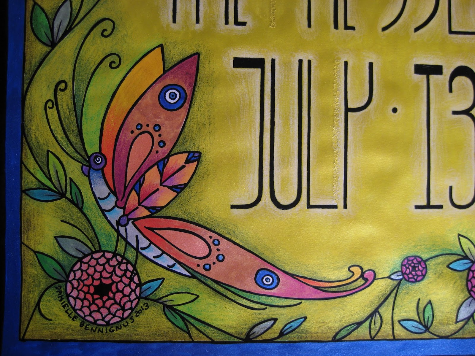
Anyhow.  This poster was a real joy, not only in that I took the easier route with metallic ink throughout, but also because we decided to increase our standard poster size from 8 1/2 x 11" to 11 x 17".  This freed my mind and hand up immensely, allowing much more room for design.  I had recently been reading about Louis Comfort Tiffany, and his stained glass creations clearly affected the thing.  The butterfly, as with so many other features in my work, offers Nazar Boncugu references in its wings.  (Also, if you look closely alongside the "y", you can see a correction/repair made, as my often-distracted mind initially thought an area that shouldn't have been inked... should.  X Acto blades and patience are absolute necessities when this lamentable situation occurs...)


I chose to embrace the vertical nature of the dimensions, and went with somewhat Mackintosh-inspired lettering.  Super Black on bright yellow ink, with white pencil shading behind the figures to help things pop.  You can see the reflective mica in the photo below - more of that to come...


Bees.  Our household is rather nutty for these beasts, as they have long flocked to the datura wrightii plants that have followed me through several moves.  In this case, however, they have to make do with Beardsley-inspired "fish scale" roses...


An angled shot of the poster, to show a bit more of the reflective nature of the metal-based inks.  Between the vividness of the inks, and the layered shades of the pencils, the resulting color reminds me of nothing so much as Liquore Strega (a favorite).  Granted, this sheen doesn't show up in the reproductions we distribute throughout town, but the intense colors come up beautifully.  There is also something rewarding about their visual appeal, on pieces I decide to frame... at least, unless they are hidden behind another piece within that frame.  Seeing this one again, it's probably time to give it the greater honor of actually being shown...


My best wishes always, and stay tuned for the next poster.