Showing posts with label Display. Show all posts

Tuesday, December 22, 2015

Two Charmers


It's that time again - New Year's Eve is just around the corner, and that means just one thing - Another Poster for the Orchestra. This time around, I decided to let a sea lion play the starring role, balancing a ball upon his nose, ushering in the year 2016.


The usual parties are in attendance - linear lettering, metallic inks, plenty of shading and fun with color. It's a bold design, as confident as the traditional jazz played by the Singapore Slingers themselves.


For good measure, a nice close up of our main attraction, suitably attired in a sort-of-tux, appropriately fitted to his sinuous shape. As always, our New Year's Eve performances are a heady blend of elegance and tomfoolery - as such, this is a perfectly representative poster!


And now, allow me to introduce... Miss Luxe. She was designed for www.savoirluxe.com - a wonderful, Dallas-based consignment service that specializes in high-end designer clothing and accessories. The company's owner/director is the marvelous Mindy Loll, who is a force unto herself! She saw a small display of my prints at Vintage Martini, the Dallas vintage and designer clothing boutique, and immediately commissioned a "flapper, with touches of gold and silver". Miss Luxe will help represent SavoirLuxe, and I couldn't be happier about it.


 Miss Luxe's gold and silver elements are rendered in mica-based ink - the beading of her gown, plumage and champagne coupe are redolent with it.


Two new projects to finish off the year, with more around the corner. As you'll see in the coming days, there have been other pieces, as well - vivid, eclectic, playful and pleasing. You'll enjoy what's ahead.

To visit the fantastic shop now carrying my prints, see www.vintagemartini.com

For more information on Mindy Loll's company, please visit www.savoirluxe.com


Sunday, September 29, 2013

Promotion and Plumage

I've been absent recently, taken with outside concerns, and happily, the creation of a new piece or two to share.  This time around we have another Singapore Slingers poster - two events advertised on one image.  Halloween is just around the corner, and though I wanted to steer clear of the usual pumpkins, ghouls and black cats, I embraced the traditional colors.  Here we go:


 I needed two strong areas of contrast for the venues to be noticeably listed, so I gave our model two large "fans" - something of a lunar Sally Rand.  I used to include venue addresses, show times, cost and such - nowadays, I figure that if someone is intrigued by the image, they can do the homework necessary for more details.  Our shows are gladly becoming more and more popular, often selling out - as such, there is more room on the posters for imagery, rather than extensive information.  Let's have a look at our lady...


She's simple in nature, but evocative of the fact that costumes are encouraged, particularly at the latter of the two shows.  The more festive our audience, the better the show - a sensible truth. 


 The fans were a joy to enhance along the edges, extending abstract plumes to fill in the outside negative space, and make it a bit more clear what the gal is handling.  It goes without saying that feathers are a joy to illustrate - and seeing as how I strongly refrain from purchasing them nowadays (part of a largely vegetarian lifestyle), this provides me a manner in which to celebrate them vicariously, without harm to the creatures that wear them.

A closer look at the lettering:


Lettering design is always initially intimidating - I'm sure it will be, eternally.  I tend to over-think in this matter, worrying that I won't capture the theme appropriately.  The words are easy - the styling of those words instills fear.  In this case, I went just as vertically as with the last poster - just a little more tapered along the bottom, and in chartreuse against purple.  Regardless of the silhouette, the letters must "pop" visually, in order for the poster to catch the eye of passersby - colors help immensely in this aspect.

Finally, the signature.  On my non-commercial work, I sign almost exclusively with an initialed oval, also stating the date of completion.  On posters, however, I have to bear in mind that the viewer might want to see more of what I do - so it makes sense to provide the full name (as well as the copyright notice), so they can find me online, should they so desire.  Always a strange balance of letting the piece shine, and trying not to be too obvious in my plea to be noticed professionally.

To the season, and further musical endeavors.  I couldn't be more pleased to know that these pieces help to garner more attention around the orchestra... and more tickets sold.  Success...

Sunday, September 15, 2013

Garden of Pleasures


I have a way of driving myself somewhat crazy, in terms of procrastinating when it comes to posting new work on the blog.  This is a perfect example - the most recent Singapore Slingers poster, for an event back in July.  I kept meaning to photograph and document, but waited so long that I actually forgot where the original drawing ended up.  After a half-hour of frustrated portfolio-scanning, I recalled that it was hidden in a frame, behind another poster.  For safe-keeping, which is a great concept - but not so great when the location is forgotten entirely.  Safe, indeed...

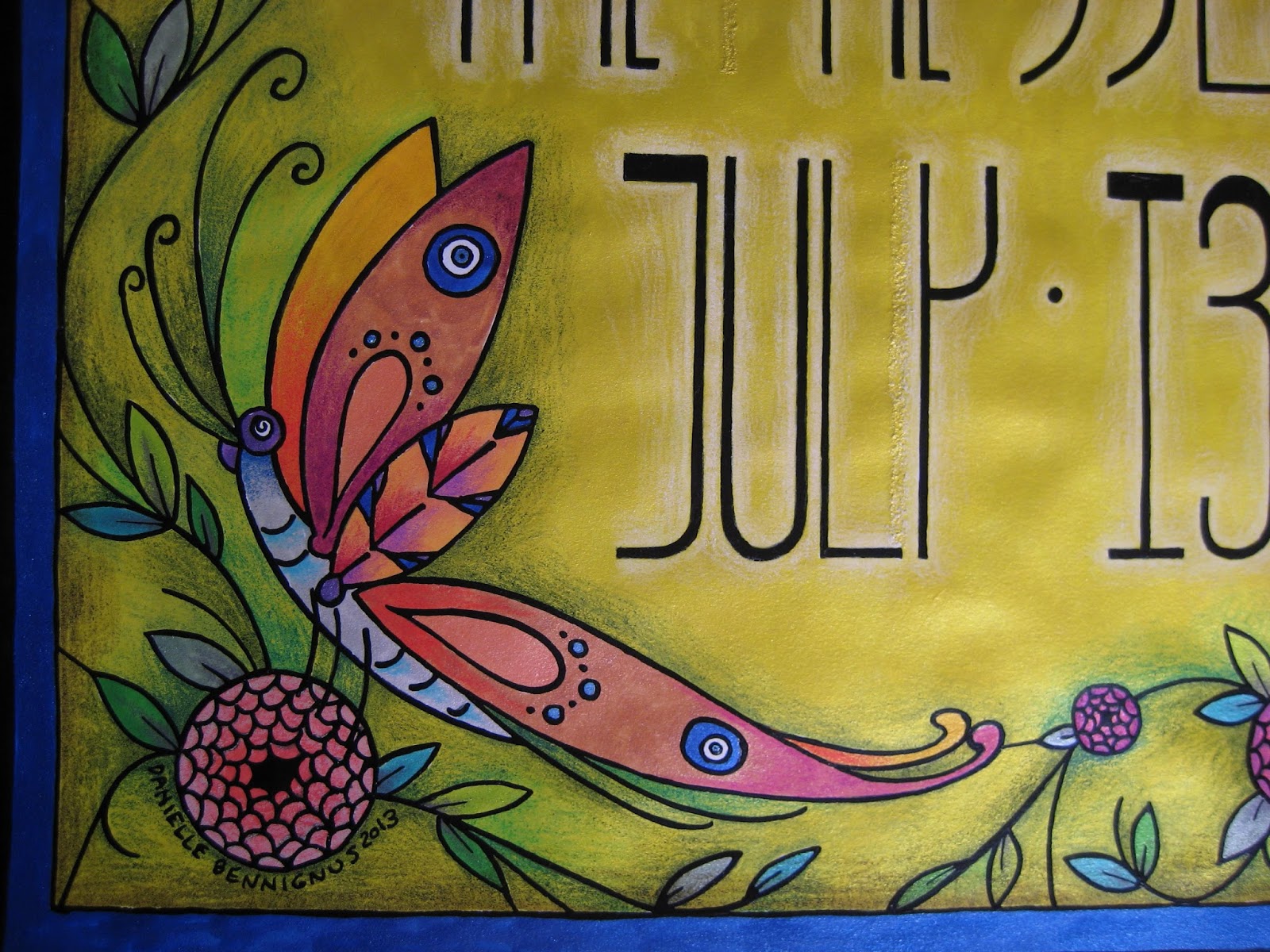
Anyhow.  This poster was a real joy, not only in that I took the easier route with metallic ink throughout, but also because we decided to increase our standard poster size from 8 1/2 x 11" to 11 x 17".  This freed my mind and hand up immensely, allowing much more room for design.  I had recently been reading about Louis Comfort Tiffany, and his stained glass creations clearly affected the thing.  The butterfly, as with so many other features in my work, offers Nazar Boncugu references in its wings.  (Also, if you look closely alongside the "y", you can see a correction/repair made, as my often-distracted mind initially thought an area that shouldn't have been inked... should.  X Acto blades and patience are absolute necessities when this lamentable situation occurs...)


I chose to embrace the vertical nature of the dimensions, and went with somewhat Mackintosh-inspired lettering.  Super Black on bright yellow ink, with white pencil shading behind the figures to help things pop.  You can see the reflective mica in the photo below - more of that to come...


Bees.  Our household is rather nutty for these beasts, as they have long flocked to the datura wrightii plants that have followed me through several moves.  In this case, however, they have to make do with Beardsley-inspired "fish scale" roses...


An angled shot of the poster, to show a bit more of the reflective nature of the metal-based inks.  Between the vividness of the inks, and the layered shades of the pencils, the resulting color reminds me of nothing so much as Liquore Strega (a favorite).  Granted, this sheen doesn't show up in the reproductions we distribute throughout town, but the intense colors come up beautifully.  There is also something rewarding about their visual appeal, on pieces I decide to frame... at least, unless they are hidden behind another piece within that frame.  Seeing this one again, it's probably time to give it the greater honor of actually being shown...


My best wishes always, and stay tuned for the next poster.

Wednesday, September 11, 2013

Gearing Up


 So, after brief absence, I have returned with the finished piece I was roughing out at the time of my last post.  Let's have a look at the Derby Racer horse in full bloom, with a self-portrait astride... I have plans for this illustration.
 

 I don't believe I've mentioned it before, but I'm shamelessly in love with my vehicle, a 1994 Caprice Classic station wagon.  I envision the old boy as a sturdy, reliable draft horse - loaded with power, yet possessing a sensitivity that makes long trips a sheer delight.  I adore that machine.  However, I had long wanted a mode of transportation that reminds me of a harrowing, exciting ride aboard a racehorse... in this case, a Derby Race(r) example.  That machine came along my way in the shape of this:


 A wonderful 2003 Stella scooter.  I recently learned that a dear friend had decided to part with it, and I hopped on the offer immediately.  Still in the process of becoming street-legal, I furthered my bonding with the scooter by coming up with this design.  The image will be printed on vinyl, and applied to the cowls (wheel covers), just above the checker border...


 ... a happy marriage of new design and existing trim, and characteristic of speed and movement.  I'm very excited to see how the whole picture looks.  The checkerboard continues in the model's dress, scarf and helmet, and her mount is a very close representation of Marcus Illions' impeccable Rye Playland carvings.  I insisted on a palomino, the colors of which lent themselves to all sorts of tonal joys in the horse's trappings.


 As usual, I incorporated metallic ink - this time in the tack hardware, and along the rear of the saddle blanket...


I am awfully fond of natural horn-colored hooves, and put them on this beast.  The ankles and fetlocks of horses are an honest-to-God treat to draw.


Finally, for the sake of shaking things up a bit, I'm posting two images of what my work looks like in the Land of In Between, when I am beginning to apply ink via nib and inkwell.  My last entry featured raw sketches - this is the final rendition of graphite on bristol, after many layers of finessing and contemplating the sketch into a line drawing.  It's a gradual process of refining and elimination of unnecessary excess - using tracing vellum, I make a carbon with a wood-less pencil on the back, and transfer the whole shindig to smooth bristol (400 series, don't waste your time with anything else.  I learned the hard way).


 One more, of the horse's girth strap.  Once the ink is applied and fully dried, I go through with a drafter's cloth eraser bag and gently remove the graphite.  Then it's on to the coloring process, and re-inking, if I so choose.  The process is at times terrifying (once you've gone through the experience of a hand-tremble after nearly finishing a piece, you learn to breathe at meditation-level as you work from that point on), but deeply rewarding.  I never learned a thing about computer-oriented graphic design, and frankly have no interest - for me, it's all about the process of working on paper, with relatively primitive tools.  A very, very deep joy.

Here's to the road ahead...

Tuesday, January 24, 2012

Kitschmas!

Although it's a bit late, I thought I'd take the opportunity to share a view on our annual Christmas display - perhaps better termed a "Kitschmas Display". For a little over 15 years, I've put up my late 1950s aluminum tree, for two reasons. Firstly, because I've had an obnoxious weakness for the tacky things ever since I saw one for the first time. Secondly, in honor of my late mother, who surprised me on Christmas day with this tree... which happened to be the aforementioned "first vision". In her usual, thoughtful way, she timed the entire gifting process into a great production, involving drama, despair and a beautiful wind-up of relief and celebration. I don't think I've mentioned her often enough in this blog - she was the Real McCoy. On to the ornaments!

This is one of my long-time favorites, likely a Shiny-Brite dating from the WWII era. I recently learned of the company's practice of painted stripes on clear glass, a wise move during a time of rationing and conservation. In this case, less is more. It reminds me of Easter, with white, canary yellow and lilac tones.

My brother kindly sent me this beautiful 1950s flocked icicle piece, along with a slew of other vintage decorations. It's incredibly graceful and fragile as the dickens - pure in nature, likely being the most dignified ornament on the tree year after year.

During their years together, my parents gave each other Easter baskets, but tucked inside German paper eggs. This is a survivor, most others likely lost in moves, or crushed over time and under family records. Luckily, it's small enough to hang from the tree, not causing undue stress to the tinseled boughs.

A nifty Waterford seahorse ornament, reminding me of my happy years as a display technician at the company's Madison Avenue showroom. Waterford's mercury glass ornaments are like explosions of color, vibrating against the silver strands of this tree. No evergreen could show them off anywhere near as much. In the back, you can see a "Giddies" ornament design that I created for the company about 5 years ago, for a second collection that never hit the shelves. A shame, as they outdid the skaters designs hand over fist.

A nice little grouping, including the German pickle. Ours is ridiculously easy to find, thanks to its size and environs - at least we made the effort. Here you can also see one of our wooden pieces, as well as a Peruvian crocheted bird. A number of these more organic items came from the collection of Otto Thieme, the late, remarkable curator of costume, textiles and African arts at the Cincinnati Art Museum. Oftentimes I think of him and his guidance years ago, when I donated a Paul Poiret robe to the museum (another story for another day) - he is well remembered during the Christmas season, thanks to his ornaments.

Finally, our color wheels! Aluminum trees and string lights Do Not Mix Well, thanks to the risk of exposed metal against electric wiring. The solution? Rotating gel lamps, that cast alternating shades against the silver boughs. At night, it's a wonderful effect - and in this case, two are better than one. You can also see the incredible tree skirt that Matt's great-grandmother made by hand, likely in the late 1940s. Outside of many of the ornaments, most of the setup is original, from the wheels down to the tree itself, made by the Revere Aluminum Tree Company (model T-45). I hope you've enjoyed the little tour - I'll likely be revisiting this post come August, if this Texas summer is anything like the last!

Saturday, December 17, 2011

Another Year, Another Poster!

Just in time for the holiday season, we will be distributing copies of this poster throughout Dallas, in preparation for our New Year's show at the Kessler Theatre. This is one of my favorites so far, with some new technical twists that I wouldn't have thought of in earlier projects. For those new to Brave Combo (who we are thrilled to share the stage with for the evening), they are a much-beloved group from Denton, TX... and it's very difficult to categorize them. Nowadays, they focus largely on what I would term "fusion polka", incorporating classical, jazz and rock elements into the dance tempo. However, their influences and practices go far beyond that - my first exposure to them was thanks to their collaboration with Tiny Tim, for their album, "Girl". Anyone who appreciates the late, incredible Tiny is good people in my book. But on to the drawing. Let's have a look!

The whole idea here was to connect the Germanic (polka) with the Freewheeling (jazz) - what better way than to feature two pin-ups, toasting the beginning of the new year? My Teutonic cutie sports lederhosen and miesbacher hat, trimmed in a somewhat unorthodox gamsbart. With a characteristically teeny waist and shapely legs, she proves that lederhosen can be sexy. A look at the metallic scroll on the steel-colored garment...

I've said it so many times... I love metallic inks. The mica pops right off the surface of the drawing, and the relatively even nature of the liquid allows for clear, strong delineation of details. It just hums among the more muted pencil. And now for our jazz belle...

Of course, she's a redhead. I figure that I'll likely be doing most of the Charleston dancing that night, so why not? The only caveat - I just wish I had a beaded dress like this one! I shamelessly detest the cheap, historically-insulting fringed "flapper" costumes that have flooded the market since, oh, 1955 - but beaded strands are more than good by me. Hell, I have a circa 1912 evening gown with just that trim all down the front - appropriate is the word. Our girl holds a champagne glass, whereas her cohort prosts with beer - a happy cultural blend.

And now, a look at my favorite aspect at play, the colors!

I've learned over the years that, despite my gratefulness for a steady-ish hand in terms of pen and ink, the color palette I adopt tends to find itself, and evolve over time. Sometimes it's brash, often soft, here and there in-between... it just happens on its own terms. This time around was no different, but I tried a new technique, to help the girls and central timepiece stand out. Over a base of numerous metallic inks, I did a bit of color shading and white-washing, to mute the tones down. What I ended up with reminds me somewhat of the great traditional fairground painters, such as Sid Howell and Fred Fowle. If I haven't mentioned these all-too-often overlooked artisans, Please Look Them Up. They were masters of leafing and painting techniques, highly respected in their time for their work on early English amusement rides. I would be tempted to give any number of toes for the mastery of what those men were capable of...

Anyhow, away from such gruesome praise! I hope you've enjoyed today's entry - I only hope that it won't be the last this year! But, just in case, here's wishing you a wonderful, prosperous, healthy and happy...
... and Many Happy Returns!

Matinee Melodies


Granted, I apologize for this being a touch late to the party - but at long last, I present the poster for our last show, "Matinee Melodies". This was a program celebrating the music of 1930s Hollywood, so I went with simple black and white, with a cinematic theme. Let's have a look at our model...

As Norma Desmond famously said in Sunset Boulevard, "We had faces!" - and I quite enjoy this lady's coy countenance. She holds her trusty Western Electric carbon microphone, although the cord isn't attached to the element - the magic of illustration, in favor of a better line! Her evening gown is cinched with film, that cascades into a train, circling around the perimeter of the drawing...

A lot of fun, as I love to work with long, fluid curves. The "Matinee Melodies" lettering is actually India ink on white bristol - I prefer to let the paper itself show through, rather than use white ink on top. You can see how rough the inked surface is here...

And finally, a little detail - one of her feet. Just short of being indicative of a fetish, I love feet, and get a kick - no pun intended - out of drawing them. Heels, pointe shoes and slippers in particular have a power over my pen, sneaking in at every opportunity.


What else do I like? Seeing these lines so close-up. I tend to get lost in the moment when I'm working, and miss out on how India ink plays with the almost-smooth surface of bristol, like a funny ballet between the weight/control of my hand, and the unique character of whatever nib I'm using at the moment. And trust me, no two are alike - not only in terms of makes and models, but individually. It's a pain and a joy, working with such temperamental tools.

Up next - the antithesis of this drawing, a veritable orgy of color! Stay tuned!

Saturday, August 27, 2011

Fur and Foliage: An Autumn Treat

It's that time again - another Singapore Slingers concert is around the corner, and nothing gets the word out around town so well as a playful poster. This time the theme is "Fall Frolic", taking a cue from the seasonal college parties of the 1920s. To me, Fall brings forth thoughts of falling leaves, and plenty of squirrels. And considering I used to have a good friend who happened to be a squirrel, this illustration brought back some great memories. Let's have a look at two profiles of these arboreal wonders...

The two featured here get the musical treatment, appropriately enough - a somewhat Dixieland theme, resplendent in peppermint-striped vests and straw boaters. While I'm personally more familiar with the Northern Grey Squirrel crowd, I added a touch of terra cotta pencil to these fellows, as Red Squirrels are the common Dallas variety. Our trumpet player...

Of course, plentiful use of metallic ink is at play here - short of the squirrels themselves, nearly the entire surface of the bristol is layered in it, along with colored pencil. I greatly enjoyed working on the leaf, trying out a good handful of varying tones on top of the copper ink...

... A simple, nutty detail...

And at last, an unusual, un-bordered font. A minor departure for me, as I almost always line words out with at least a thin, solid black border - in this case, I went for a somewhat "neon sign" appearance.
Finally, several words of good news - the Slingers will be playing on September 23rd with jazz legend Leon Redbone, at the Kessler Theatre in Dallas. As well, the orchestra has been nominated in the Best Jazz Group category of the Dallas Observer Music Awards - hop by their website and place your vote! We're honored by the nomination alone, but to win would be truly wonderful.

Look for further updates - I will be working on a new poster for the aforementioned Leon Redbone show, and creating new stand flags for Matt's Czech band, the Royal Klobasneks. Plenty of illustration and sewing lay ahead!

Thursday, June 30, 2011

In the News...

I wanted to post a little update - Matt has been featured in Modern Luxury Dallas magazine this month! Although the article is brief in body, it has a lot to say regarding his love of the music, and the inspirations behind the Singapore Slingers. Have a look at the link provided:

Modern Luxury Dallas


Enjoy!