Showing posts with label Jazz. Show all posts

Tuesday, December 22, 2015

Two Charmers


It's that time again - New Year's Eve is just around the corner, and that means just one thing - Another Poster for the Orchestra. This time around, I decided to let a sea lion play the starring role, balancing a ball upon his nose, ushering in the year 2016.


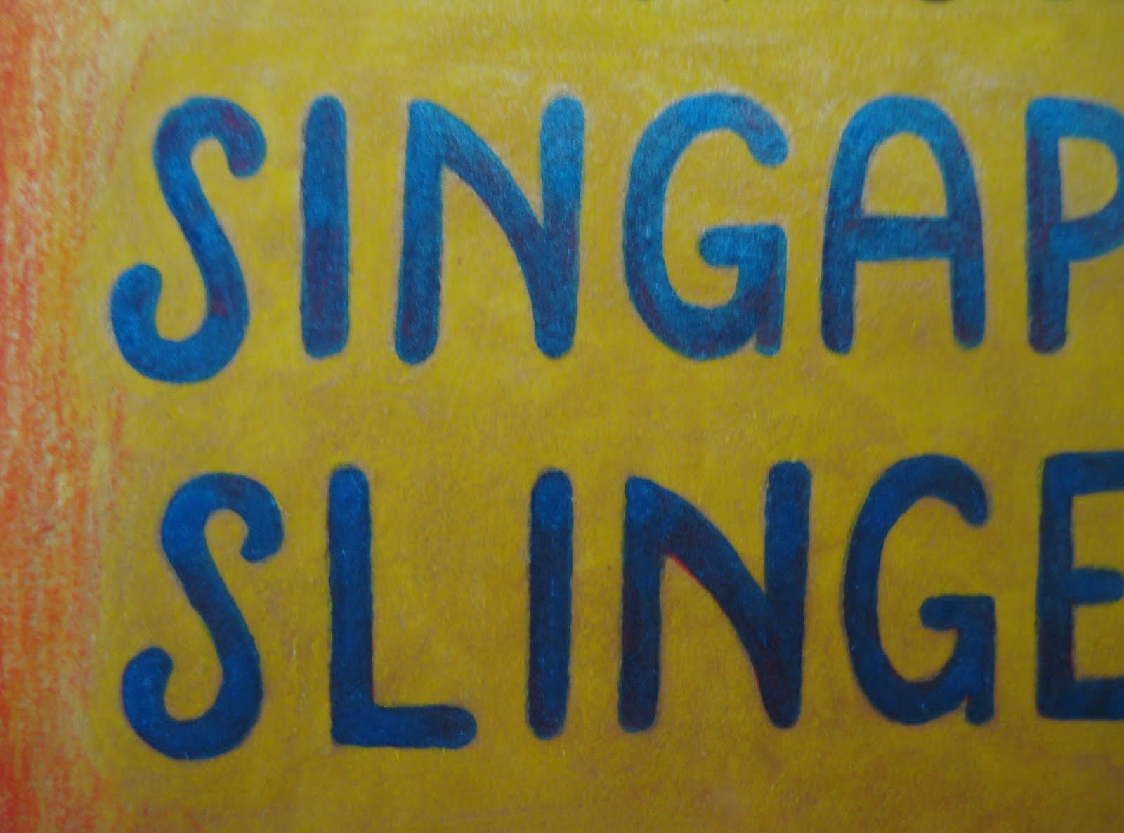
The usual parties are in attendance - linear lettering, metallic inks, plenty of shading and fun with color. It's a bold design, as confident as the traditional jazz played by the Singapore Slingers themselves.


For good measure, a nice close up of our main attraction, suitably attired in a sort-of-tux, appropriately fitted to his sinuous shape. As always, our New Year's Eve performances are a heady blend of elegance and tomfoolery - as such, this is a perfectly representative poster!


And now, allow me to introduce... Miss Luxe. She was designed for www.savoirluxe.com - a wonderful, Dallas-based consignment service that specializes in high-end designer clothing and accessories. The company's owner/director is the marvelous Mindy Loll, who is a force unto herself! She saw a small display of my prints at Vintage Martini, the Dallas vintage and designer clothing boutique, and immediately commissioned a "flapper, with touches of gold and silver". Miss Luxe will help represent SavoirLuxe, and I couldn't be happier about it.


 Miss Luxe's gold and silver elements are rendered in mica-based ink - the beading of her gown, plumage and champagne coupe are redolent with it.


Two new projects to finish off the year, with more around the corner. As you'll see in the coming days, there have been other pieces, as well - vivid, eclectic, playful and pleasing. You'll enjoy what's ahead.

To visit the fantastic shop now carrying my prints, see www.vintagemartini.com

For more information on Mindy Loll's company, please visit www.savoirluxe.com


Sunday, September 29, 2013

Promotion and Plumage

I've been absent recently, taken with outside concerns, and happily, the creation of a new piece or two to share.  This time around we have another Singapore Slingers poster - two events advertised on one image.  Halloween is just around the corner, and though I wanted to steer clear of the usual pumpkins, ghouls and black cats, I embraced the traditional colors.  Here we go:


 I needed two strong areas of contrast for the venues to be noticeably listed, so I gave our model two large "fans" - something of a lunar Sally Rand.  I used to include venue addresses, show times, cost and such - nowadays, I figure that if someone is intrigued by the image, they can do the homework necessary for more details.  Our shows are gladly becoming more and more popular, often selling out - as such, there is more room on the posters for imagery, rather than extensive information.  Let's have a look at our lady...


She's simple in nature, but evocative of the fact that costumes are encouraged, particularly at the latter of the two shows.  The more festive our audience, the better the show - a sensible truth. 


 The fans were a joy to enhance along the edges, extending abstract plumes to fill in the outside negative space, and make it a bit more clear what the gal is handling.  It goes without saying that feathers are a joy to illustrate - and seeing as how I strongly refrain from purchasing them nowadays (part of a largely vegetarian lifestyle), this provides me a manner in which to celebrate them vicariously, without harm to the creatures that wear them.

A closer look at the lettering:


Lettering design is always initially intimidating - I'm sure it will be, eternally.  I tend to over-think in this matter, worrying that I won't capture the theme appropriately.  The words are easy - the styling of those words instills fear.  In this case, I went just as vertically as with the last poster - just a little more tapered along the bottom, and in chartreuse against purple.  Regardless of the silhouette, the letters must "pop" visually, in order for the poster to catch the eye of passersby - colors help immensely in this aspect.

Finally, the signature.  On my non-commercial work, I sign almost exclusively with an initialed oval, also stating the date of completion.  On posters, however, I have to bear in mind that the viewer might want to see more of what I do - so it makes sense to provide the full name (as well as the copyright notice), so they can find me online, should they so desire.  Always a strange balance of letting the piece shine, and trying not to be too obvious in my plea to be noticed professionally.

To the season, and further musical endeavors.  I couldn't be more pleased to know that these pieces help to garner more attention around the orchestra... and more tickets sold.  Success...

Tuesday, January 24, 2012

Oh, We Know What It Means...

Matt and I have been feeling the itch lately, and realized it was high time we visited New Orleans again. This time around, we were infinitely blessed to meet up with my brother, Christian, and my oldest/dearest friend, Tony. As well, it was only natural that we should meet up with the much-lauded celebrity of this blog (as well as the outside world) - George Schmidt!

A large part of our visit centered around the opening of his show at the University of Louisiana Hilliard Art Museum: "Satire, Scandal and Spectacle". This unforgettable evening found us, along with a group of George's fans, models, family and friends, on a bus trip to Lafayette for the show. Along the way we enjoyed the beauty of the Cajun region, a stop in Franklin, a boxed dinner and more - and the show itself was incredibly inspiring, uplifting and filled with the human side of history. The exhibit featured his larger works, centering around the history of Louisiana - Roman law, Jean Lafitte, Storyville, Mardi Gras and political events were only the beginning. His work is incomparable, and only part of what makes George a very special man.
A group photo after the trip, including Tony (next to me), Christian (next to Tony), and Patty Gay. Patty is George's wonderful wife, who we finally got to spend a good deal of quality time with. A true leader in the fight for historic preservation, and a truly endearing woman. What the modern lingo would term a "Power Couple".

Another photo from the bus ride - George had brought along a gifted banjo player for the ride, and Matt joined in on the accordion. Everything from ragtime to German waltzes to traditional jazz was played - I only wish I remember what song was being sung, here!

Finally, two treats from our first night visiting. As usual, we spent some time in the garden at George's studio, trading jokes, chatting on history, listening and learning... the constant highlight of our New Orleans journeys. After a proffered voodoo lily was planted among the jasmine and angel's wings, we headed upstairs, where wine and cheese were served. An honor, to be sure... and eventually Matt found his way to the piano, and played a few tunes.

True, there are myriad other things to do in New Orleans - and we do indulge in them. In such a city that never stops giving and giving, we are more than happy to eat to excess, drink perhaps a bit too much, feast our eyes on the beauty of endless architectural wonders, soak in the unbelievably historic depths of the place... embrace all that we are able to in a short time. But invariably, we find our way back to Julia Street, to laugh, think, reflect and learn - be inspired - by one of our world's great living artists, and a family that champions history and culture. As an illustrator, I inevitably find renewed inspiration, increased respect for my gift, and a better sense of responsibility to keep creating - strength in quality, as well as quantity. I told George that I see him as an adopted uncle, to which he replied, "Good lord! Who'd want me in the family?!" I could certainly do worse!

Saturday, December 17, 2011

Another Year, Another Poster!

Just in time for the holiday season, we will be distributing copies of this poster throughout Dallas, in preparation for our New Year's show at the Kessler Theatre. This is one of my favorites so far, with some new technical twists that I wouldn't have thought of in earlier projects. For those new to Brave Combo (who we are thrilled to share the stage with for the evening), they are a much-beloved group from Denton, TX... and it's very difficult to categorize them. Nowadays, they focus largely on what I would term "fusion polka", incorporating classical, jazz and rock elements into the dance tempo. However, their influences and practices go far beyond that - my first exposure to them was thanks to their collaboration with Tiny Tim, for their album, "Girl". Anyone who appreciates the late, incredible Tiny is good people in my book. But on to the drawing. Let's have a look!

The whole idea here was to connect the Germanic (polka) with the Freewheeling (jazz) - what better way than to feature two pin-ups, toasting the beginning of the new year? My Teutonic cutie sports lederhosen and miesbacher hat, trimmed in a somewhat unorthodox gamsbart. With a characteristically teeny waist and shapely legs, she proves that lederhosen can be sexy. A look at the metallic scroll on the steel-colored garment...

I've said it so many times... I love metallic inks. The mica pops right off the surface of the drawing, and the relatively even nature of the liquid allows for clear, strong delineation of details. It just hums among the more muted pencil. And now for our jazz belle...

Of course, she's a redhead. I figure that I'll likely be doing most of the Charleston dancing that night, so why not? The only caveat - I just wish I had a beaded dress like this one! I shamelessly detest the cheap, historically-insulting fringed "flapper" costumes that have flooded the market since, oh, 1955 - but beaded strands are more than good by me. Hell, I have a circa 1912 evening gown with just that trim all down the front - appropriate is the word. Our girl holds a champagne glass, whereas her cohort prosts with beer - a happy cultural blend.

And now, a look at my favorite aspect at play, the colors!

I've learned over the years that, despite my gratefulness for a steady-ish hand in terms of pen and ink, the color palette I adopt tends to find itself, and evolve over time. Sometimes it's brash, often soft, here and there in-between... it just happens on its own terms. This time around was no different, but I tried a new technique, to help the girls and central timepiece stand out. Over a base of numerous metallic inks, I did a bit of color shading and white-washing, to mute the tones down. What I ended up with reminds me somewhat of the great traditional fairground painters, such as Sid Howell and Fred Fowle. If I haven't mentioned these all-too-often overlooked artisans, Please Look Them Up. They were masters of leafing and painting techniques, highly respected in their time for their work on early English amusement rides. I would be tempted to give any number of toes for the mastery of what those men were capable of...

Anyhow, away from such gruesome praise! I hope you've enjoyed today's entry - I only hope that it won't be the last this year! But, just in case, here's wishing you a wonderful, prosperous, healthy and happy...
... and Many Happy Returns!

Matinee Melodies


Granted, I apologize for this being a touch late to the party - but at long last, I present the poster for our last show, "Matinee Melodies". This was a program celebrating the music of 1930s Hollywood, so I went with simple black and white, with a cinematic theme. Let's have a look at our model...

As Norma Desmond famously said in Sunset Boulevard, "We had faces!" - and I quite enjoy this lady's coy countenance. She holds her trusty Western Electric carbon microphone, although the cord isn't attached to the element - the magic of illustration, in favor of a better line! Her evening gown is cinched with film, that cascades into a train, circling around the perimeter of the drawing...

A lot of fun, as I love to work with long, fluid curves. The "Matinee Melodies" lettering is actually India ink on white bristol - I prefer to let the paper itself show through, rather than use white ink on top. You can see how rough the inked surface is here...

And finally, a little detail - one of her feet. Just short of being indicative of a fetish, I love feet, and get a kick - no pun intended - out of drawing them. Heels, pointe shoes and slippers in particular have a power over my pen, sneaking in at every opportunity.


What else do I like? Seeing these lines so close-up. I tend to get lost in the moment when I'm working, and miss out on how India ink plays with the almost-smooth surface of bristol, like a funny ballet between the weight/control of my hand, and the unique character of whatever nib I'm using at the moment. And trust me, no two are alike - not only in terms of makes and models, but individually. It's a pain and a joy, working with such temperamental tools.

Up next - the antithesis of this drawing, a veritable orgy of color! Stay tuned!

Saturday, August 27, 2011

Fur and Foliage: An Autumn Treat

It's that time again - another Singapore Slingers concert is around the corner, and nothing gets the word out around town so well as a playful poster. This time the theme is "Fall Frolic", taking a cue from the seasonal college parties of the 1920s. To me, Fall brings forth thoughts of falling leaves, and plenty of squirrels. And considering I used to have a good friend who happened to be a squirrel, this illustration brought back some great memories. Let's have a look at two profiles of these arboreal wonders...

The two featured here get the musical treatment, appropriately enough - a somewhat Dixieland theme, resplendent in peppermint-striped vests and straw boaters. While I'm personally more familiar with the Northern Grey Squirrel crowd, I added a touch of terra cotta pencil to these fellows, as Red Squirrels are the common Dallas variety. Our trumpet player...

Of course, plentiful use of metallic ink is at play here - short of the squirrels themselves, nearly the entire surface of the bristol is layered in it, along with colored pencil. I greatly enjoyed working on the leaf, trying out a good handful of varying tones on top of the copper ink...

... A simple, nutty detail...

And at last, an unusual, un-bordered font. A minor departure for me, as I almost always line words out with at least a thin, solid black border - in this case, I went for a somewhat "neon sign" appearance.
Finally, several words of good news - the Slingers will be playing on September 23rd with jazz legend Leon Redbone, at the Kessler Theatre in Dallas. As well, the orchestra has been nominated in the Best Jazz Group category of the Dallas Observer Music Awards - hop by their website and place your vote! We're honored by the nomination alone, but to win would be truly wonderful.

Look for further updates - I will be working on a new poster for the aforementioned Leon Redbone show, and creating new stand flags for Matt's Czech band, the Royal Klobasneks. Plenty of illustration and sewing lay ahead!

Thursday, June 30, 2011

In the News...

I wanted to post a little update - Matt has been featured in Modern Luxury Dallas magazine this month! Although the article is brief in body, it has a lot to say regarding his love of the music, and the inspirations behind the Singapore Slingers. Have a look at the link provided:

Modern Luxury Dallas


Enjoy!

Sunday, June 26, 2011

Percussion Preservation!

As promised earlier today, I'd like to present two current restoration projects Matt and I are working on. First off, a remarkable 1920s Ludwig bass drum, complete with original, factory-painted head. Matt's been longing for one of these for quite some time, and we were thrilled to win this one in an ebay auction. Rather than have it shipped (at a steep cost and risk in cartage), we decided to take a Memorial Day weekend road trip to pick it up. Well worth the drive, and we were so happy to see good friends while in town.

Being around 90 years old, the drum presented no surprise in its need of tuning up, both aurally and physically. The head boasted a dingy layer of nicotine, grime and insect leavings (don't ask - I didn't), which we cleaned - thanks to the advice of a conservator - with saliva and cotton swabs. The results were pretty astonishing - you can see the contrast below, thanks to the last patch of unrestored paint:

There were also several spots where the paint had chipped away entirely, fixed via a light brushing of spackling, with oil paint touch-ups. This secured the areas sufficiently, and matched well enough that you wouldn't know there was damage, to begin with.


A close-up of the serene, admittedly Bob Ross-ian pastoral scene on the drum head. The whole thing measures at a full 28" - that's a lot landscape, and plenty of deep sound for the Singapore Slingers to enjoy. Our percussionist, the keenly gifted Michael Plotkin, assisted in the re-tuning of the instrument - it's hard not to fall in love with the renewed depth of tone.

And now to our second project - a set of five late 1920s temple blocks - more percussive instruments, which will eventually sit astride the bass drum. These are possibly scarcer than the bass drum, the sets most often having been broken up over the years. We bumped into this set while in New Orleans, appropriately enough - tucked away in a large antique shop. They weren't in the best of condition cosmetically, but they have all the sound one could ask for.

A good look at the lacquers we're using - I'm a devoted fan of One-Shot paints, which provide deep color and wonderful shine. The gold paint is of a "leaf-in-a-bottle" variety - initially I'd wanted to use actual leaf, but figured that would be gilding the lily, pun not intended. These blocks were factory-released having been painted - I chose to stick with that practice.

Remarkable scales adorn the blocks, in keeping with the aquatic theme...


Another, closer look at the fish head. From what I understand, these blocks were originally carved outside of the factories, then shipped raw for painting. This makes a lot of sense to me - the designs seem far more Indonesian/Philippine in nature than something that would come out of the States.A close-up of one in the restoration process - stripped of chipped and loose paint. When we found them, the blocks were literally snowing red flakes - there was little chance of salvaging what was left on them. As well, a couple of them have structural hairline cracks, which will be strengthened and sealed before painting. We were very fortunate in that One-Shot's "Bright Red" is a dead ringer for the original color - and their paints are strong enough that, once these blocks are brought into the orchestra, the new surfaces will easily withstand the frequent mallet usage they'll be seeing.


We believe that these blocks are likely from the Leedy company, but they also could have come from Ludwig. Frankly we're a bit stumped, as we've never seen them carved in a "fish" theme before. Usually they appear as little "skulls", symmetrically-designed. Whatever the case, we're very grateful that they came our way, and are doing our best to restore them properly.

Posters, Past and Present

Although I'd planned on an entry featuring our current event illustration, just as I pulled out the camera for several close-ups, I realized that I had completely overlooked the last poster! Inadvertently late, here's "Sunshine and Shadows", from our May 24th Depression-era program.

As usual, I had a lot of fun coming up with a new font...

... and I've been enjoying the heck out of illustrating gentlemen again. The recent posters have been largely female in nature, so, despite how trim and often androgynous my gents tend to be, it's still been a joy to draw them.

As well, I decided to throw in the sunshine itself, with a distinctly 1930s personality. I'm not usually prone to anthropomorphizing (well... animals, yes - otherwise, no), but the idea of a chipper, look-on-the-bright-side-and-pull-up-your-bootstraps sun, tossing coins down to the thread-worn populace, was too tempting to pass up. Maybe the dancing musical instruments in the last poster started a trend...

And now on to the current poster, advertising our Patriotic Revue. For the longest time, Matt's been aching to break out the Sousa arrangements, and what better time of year to do so than July 4th weekend?

Although I didn't want to come across as too jingoistic, I knew that a bald eagle would have to make an appearance...

... and instead of heading completely into traditional American flag turf, I decided to incorporate olive branches and arrows, as frames for the evening's musical offerings.

The center shield reminds me of a simplified carving one would find on a carousel rounding board (I couldn't avoid fairground references, regardless of how hard I could ever try)...

In all, a continuation of the tried-and-true pen, ink and pencil practices I've stuck with for so many years. In the next blog, the working materials are of a completely unrelated nature, although entirely associated with the usual subject matter. A little hint:

... See you soon with more goodies!